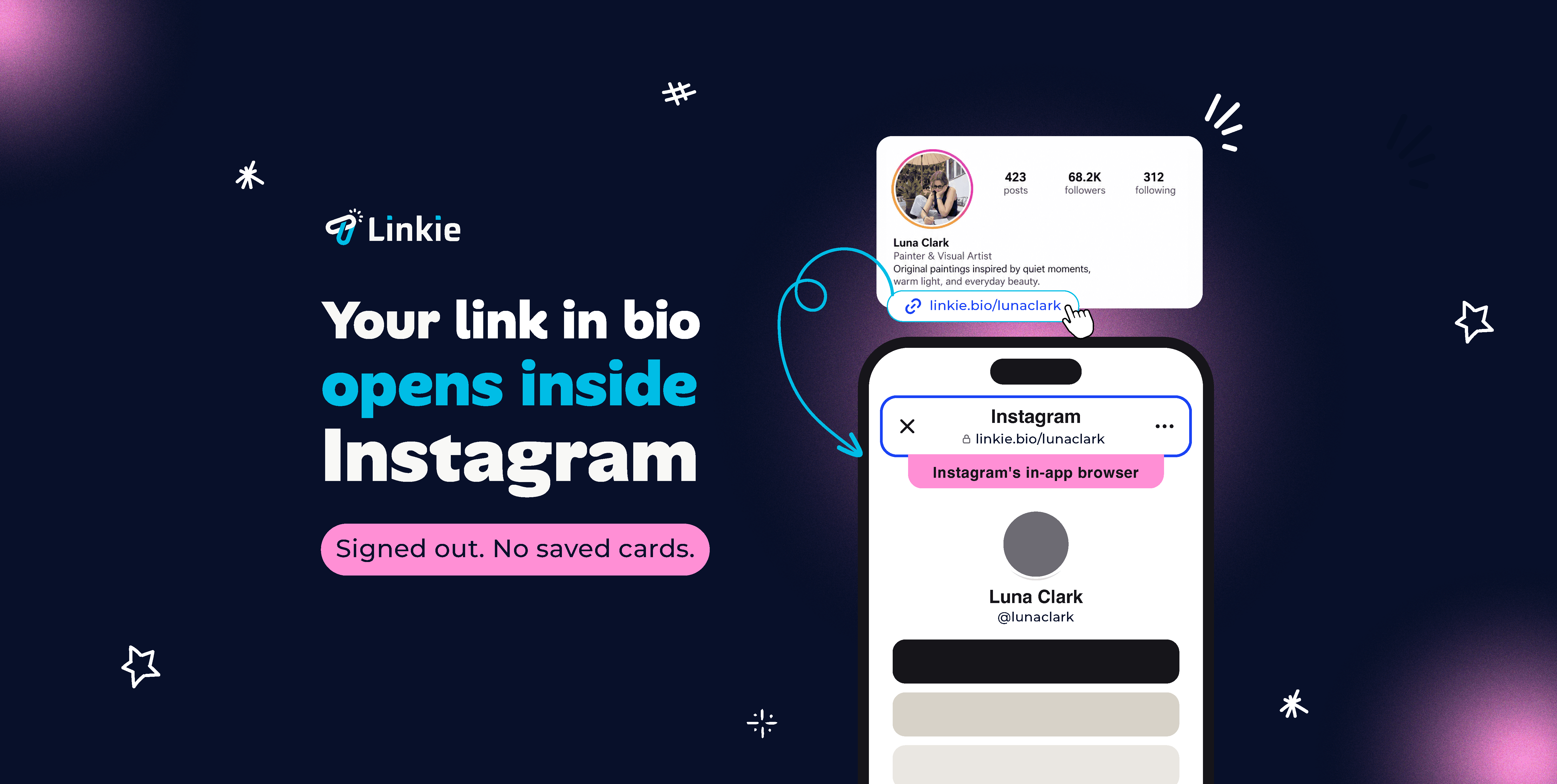



TL;DR — The three strongest Linktree alternatives on this list are Linkie, for a page that carries your own branding rather than a default template; Beacons, if the page has to sell, capture emails or take tips; and Carrd, if what you actually want is a one-page site instead of a list of links. Full comparison, pricing and free tiers below. See also bio link tools for Instagram.
Reviewed 21 August 2026 by the Linkie team.
If someone is searching for a Linktree alternative, the problem usually isn’t a lack of links. The problem is that the page looks like everyone else’s, feels cluttered on mobile, and gives visitors no obvious next step. It becomes a holding page instead of a conversion page.
That holds greater significance than often acknowledged. Instagram and TikTok traffic is impatient. People tap fast, scan fast, and leave fast. A generic stack of equal-looking buttons forces them to do the sorting work themselves, and that’s where clicks get lost.
Most users don’t need more features. They need better organization, stronger branding, and cleaner CTA hierarchy. They need a page that feels intentional, loads trust immediately, and helps someone decide what to do next without friction.
That’s the key lens for evaluating the best Linktree alternatives. Not who has the longest feature list, but who gives creators, brands, agencies, and small businesses a better way to present offers, content, and campaigns.
What Makes a Good Linktree Alternative in 2026
A Linktree alternative is worth switching to only if it fixes the reason you are leaving. Three things separate the tools below: how much the page can be made to look like your brand rather than a default template, whether it can do more than list links (email capture, products, tips), and whether the address stays yours through a custom domain. Sort by which of those you actually need before comparing feature lists.
1. Linkie — best Linktree alternative for brand-consistent design
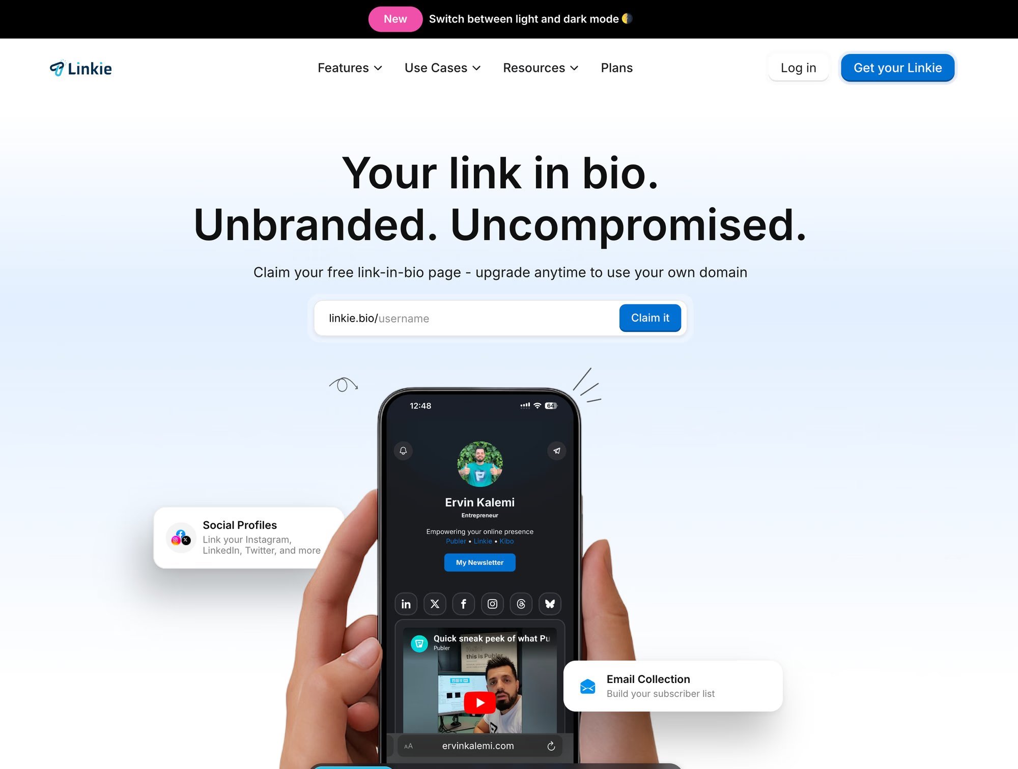
Linkie is a strong choice for people leaving Linktree because it solves one of the biggest problems with traditional bio pages: they often look too generic.
Instead of giving you a simple stack of identical buttons, Linkie lets you build a page that feels more in line with your brand. That matters because a bio page is not just a place to park links. It is often the first page someone visits after discovering you on Instagram, TikTok, or another social platform.
Linkie also has one advantage most alternatives do not: it is built by the same team behind Publer. That means Publer users can connect their social publishing workflow directly with Linkie and choose which published posts should appear or disappear from their bio page. For creators, brands, and teams already using Publer, it makes it much easier to keep the page fresh without manually updating everything.
That may sound like a small detail, but it is not. A stale bio page quietly hurts conversions. If someone clicks from a new post and lands on old links, unrelated offers, or a cluttered list of buttons, they are much less likely to take action.
Linkie helps avoid that by giving users more control over layout and hierarchy. Its card-based editor lets you drag, resize, and arrange content based on what matters most. A lead magnet can sit at the top. A booking CTA can stay prominent. Testimonials, videos, product links, social posts, or embeds can support the main offer without competing with it.
That structure makes the page feel more like a lightweight landing page than a fixed link stack, which is where Linkie feels noticeably stronger than traditional link-in-bio tools.
Why Linkie converts better
Linkie is built for people who need direction, not just destination options. Sticky promo banners keep an offer visible while someone scrolls. Embeds break up the page, preventing it from feeling like a wall of buttons. Custom thumbnails and text let you frame each click with context, rather than relying on the label to do the work.
That makes a difference for specific use cases:
Creators with multiple revenue paths: Feature a newsletter signup, latest video, sponsor page, and paid product without turning the page into clutter.
Small businesses: Put bookings or inquiries first, then support them with reviews, location info, and current promotions.
Agencies and multi-brand teams: Manage multiple pages under one account and keep reporting organized.
Publer users: Automatically surface fresh published content on the bio page, eliminating the need to manually update links after every post.
One rule matters here. The primary CTA should own the first mobile screen.
Linkie also removes a common credibility problem. The free plan does not force obvious platform branding onto the page, so even a test setup can look client-ready. That matters for coaches, consultants, ecommerce brands, and anyone using bio traffic to sell trust before they sell anything else.
Best fit
Choose Linkie if your problem with Linktree is not missing features but a weak presentation. It is the best fit for brands and creators who care about visual hierarchy, cleaner mobile scanning, and a page that guides a visitor toward a single action.
If you are comparing tools for creator-led businesses, this guide to the best link-in-bio tools for creators gives useful context.
The platform is available at Linkie.
2. Beacons — best Linktree alternative for creator monetization
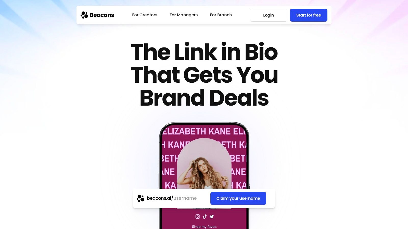
Beacons fits a different reason for leaving Linktree. Some people are not trying to make the page look cleaner. They are trying to make the page produce revenue.
That distinction matters. If your bio traffic needs to capture emails, sell digital products, collect tips, present a media kit, and route people into offers, a plain list of links is too thin. Beacons gives creators a way to keep those actions close to the click instead of sending visitors through three extra steps.
Where Beacons makes sense
Beacons works best for creator businesses that have already moved past the “all my links in one place” stage. A musician can push a release and collect fan emails. A coach can show services, qualify leads, and send people into a booking flow. A creator selling templates, guides, or downloads can keep sales within the same environment, avoiding traffic split across multiple tools.
For a broader comparison of creator-first platforms, this guide to the best link-in-bio tools for creators is useful.
The upside is obvious. More ways to capture value from each profile visit.
The downside is just as important. Beacons can get crowded fast. That is the tradeoff with all-in-one creator tools. If your real complaint about Linktree is weak branding, poor visual hierarchy, or low trust on mobile, Beacons can solve the monetization problem while still leaving you with a page that feels busy.
Best fit
Choose Beacons if your bio page needs to act like a lightweight creator storefront. It is a strong pick for digital products, lead capture, tipping, and media kits.
Skip it if your main goal is a cleaner brand presentation with tighter CTA focus. In that case, a simpler tool will convert better because it gives visitors fewer things to scan and fewer chances to drift.
The platform is available at Beacons.
3. Campsite — best Linktree alternative for a clean page without platform bloat
Campsite is a good option for people leaving Linktree for one simple reason. It usually produces a better-looking page without forcing you into a bloated creator platform.
That matters more than it sounds. A bio page fails when visitors cannot tell where to click, what matters most, or whether the brand feels credible. Campsite fixes that with cleaner layout controls, better content organization, and enough customization to make the page look like it belongs to your brand rather than the platform.
Why Campsite stands out
Campsite works best for users who already have their core stack in place and want the bio page to do one job well. Send traffic. Hold attention. Make the next click obvious.
It is especially useful for freelancers, consultants, small brands, and agencies that manage multiple profiles. You can group links, add richer content, and keep campaigns organized without the clutter that hurts conversion rates in many all-in-one tools.
Its multi-profile management is a real advantage. If you handle client accounts or separate brand pages, that feature saves time and reduces the mess that builds up quickly in cheaper tools.
Best for agencies and small teams: Easier account management across multiple profiles.
Best for brand presentation: Stronger visual hierarchy than bare-bones link hubs.
Best for campaign traffic: Good for launches, seasonal promos, and pages that need frequent updates.
Best fit
Choose Campsite if your main complaint about Linktree is that it looks generic and gives you too little control over how visitors move through the page.
Skip it if you want built-in monetization, digital product sales, or a full creator business stack. Campsite is better when your priority is a cleaner branded experience that gets people to the right destination faster.
The platform is available at Campsite.
4. Lnk.Bio — best Linktree alternative for a low-cost link hub
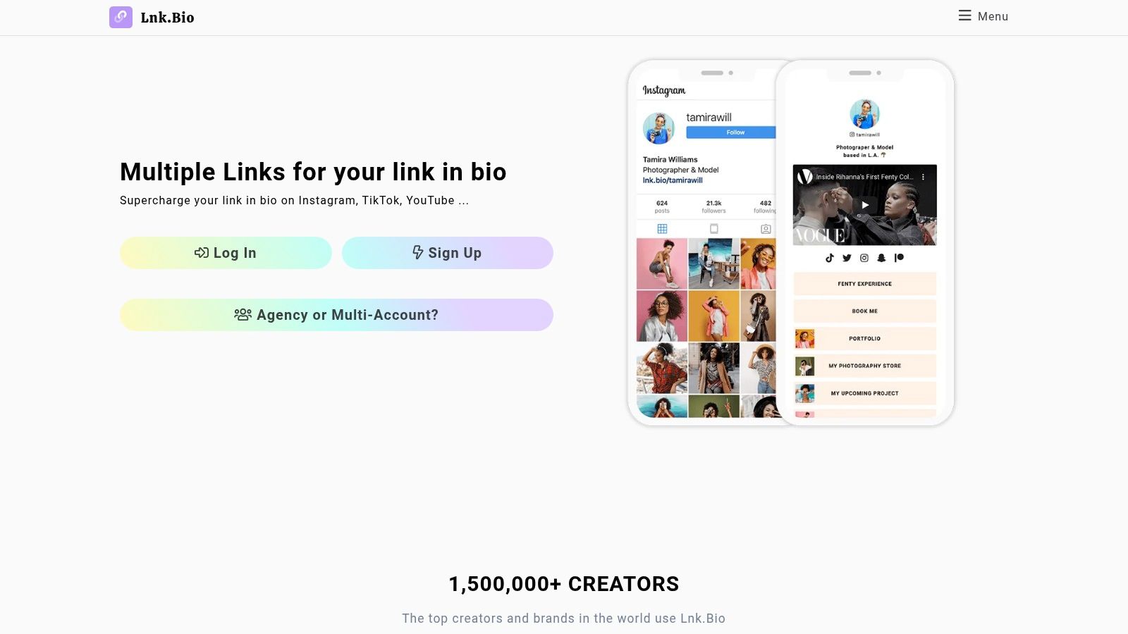
Lnk.Bio is the practical choice for people leaving Linktree for one reason. Cost.
If your real complaint is weak branding or poor visual hierarchy, Lnk.Bio will not fix that. It is still a stripped-down link hub. But if you want a cheap, stable page that takes five minutes to set up and does not bury you in extra features, it earns its spot on this list.
That makes it a smart pick for side projects, early-stage creators, local businesses, and anyone managing a bio link as a utility page instead of a conversion-focused landing page.
Where Lnk.Bio works best
Lnk.Bio wins on simplicity and price. Hostinger lists it among its Linktree alternatives as one of the lower-cost options in the category, which explains its appeal to users who want to leave Linktree without a bigger monthly bill.
The tradeoff is clear. You get a straightforward page builder and a low-friction setup, but you do not get the stronger brand control that pushes premium tools ahead in design and conversion structure.
Use Lnk.Bio if your traffic already knows what it wants and just needs a fast path to the right destination. Skip it if you are trying to shape attention, prioritize offers, or make the page feel like an owned brand asset. In those cases, page structure matters more than saving a few dollars, and this guide on optimizing your link in bio for better clicks will help you see where simple pages start to fall short.
Best for budget-first users: Low cost and quick setup.
Best for low-maintenance pages: Easy to update and easy to ignore once live.
Weak for brand differentiation: Limited design control means the page can still feel generic.
Best fit
Choose Lnk.Bio if you want the cheapest credible replacement for Linktree and care more about function than presentation.
Pass it on if the reason you are leaving Linktree is for conversion. Lnk.Bio solves affordability and convenience. It does not solve the bigger problems that usually push growing brands to switch platforms in the first place.
The platform is available at Lnk.Bio.
5. Carrd — best Linktree alternative for a full one-page site
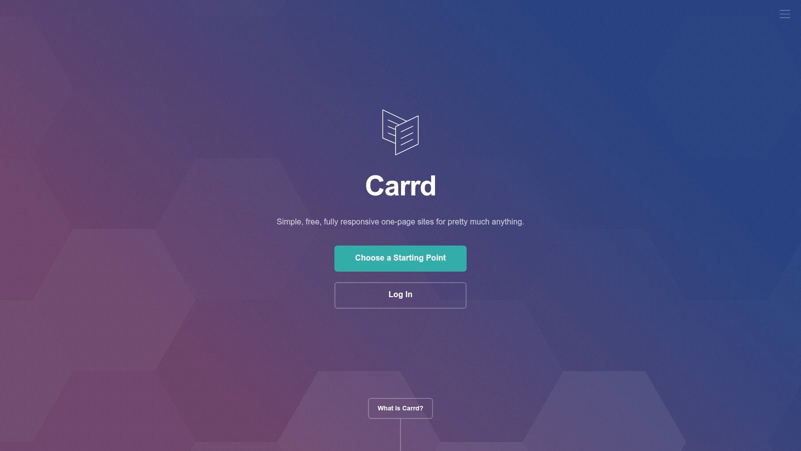
Carrd is the recommendation for people who’ve realized they don’t want another link-in-bio tool. They want a one-page site. That’s a different mindset, and Carrd fits it well.
It gives much more design control than most bio tools. Instead of thinking in terms of buttons, users can build sections, add forms, use custom code, create portfolio layouts, and shape the page like a true landing page.
Why Carrd is better for brand-first users
Carrd is strong when the bio page needs to feel completely owned. For a consultant, musician, or personal brand, that can matter more than having native creator widgets. The page can look editorial, minimal, premium, or portfolio-driven instead of “social tool template.”
Hostinger lists Carrd at $9/year in its earlier comparison, which is one of the clearest budget-to-flexibility bargains in this category.
For teams looking to improve page structure before changing tools, this guide on optimizing a link in bio is a useful companion.
A Carrd page works best when the bio link should feel like a real landing page, not a list manager.
The tradeoff is effort. Carrd offers freedom, and freedom means more setup decisions. Users who want speed and purpose-built bio workflows may prefer a platform like Linkie instead.
Best fit
Carrd is best for portfolio-style personal brands, startups, musicians, and consultants who want a fully custom mini-site at a very low annual cost.
The platform is available at Carrd.
For the prices on each plan and what the $9 one leaves out, see Linktree vs Carrd.
6. Milkshake — best Linktree alternative for mobile-first editing
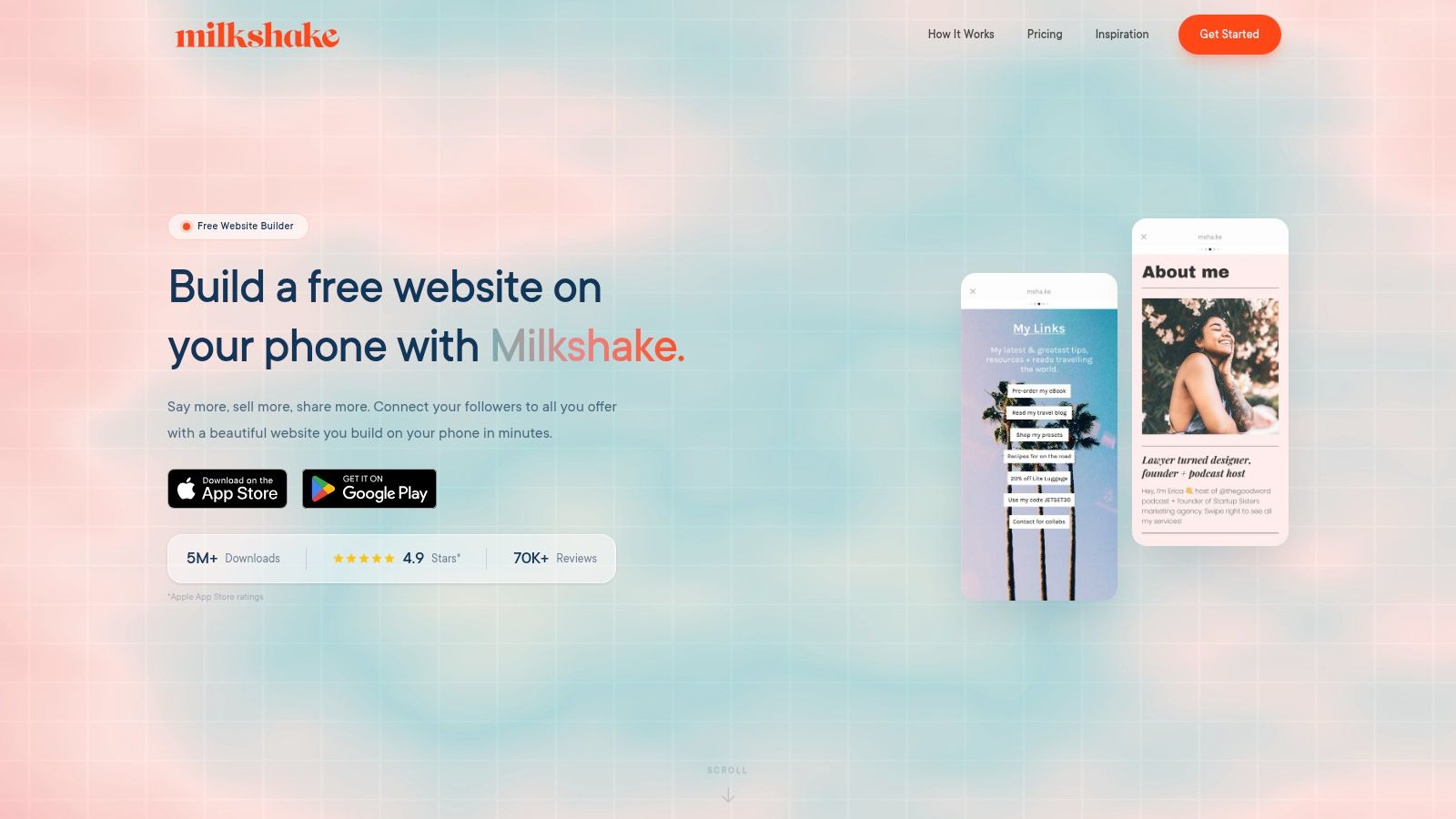
Milkshake makes sense for creators who live on their phone and want to edit their bio page the same way they manage social content. That mobile-first workflow is its main appeal.
Its card-style presentation feels more in line with social behavior than a plain list of buttons. For Instagram-first creators, that’s useful because the page can feel more like an extension of social content than a utility page.
Why Milkshake works for social-first users
Milkshake is strongest when speed matters more than precision. A creator can update cards, swap messaging, and keep the page visually active without opening a desktop builder. That’s practical for fast-moving promotions, creator collabs, or weekly content rotations.
For TikTok-heavy creators, this roundup of the best link-in-bio tools for TikTok helps frame Milkshake’s place.
The weakness is desktop control. Agencies, brands, and users who care deeply about a structured hierarchy may find it limiting. Milkshake is quick, but it’s not the tool for someone trying to build a highly controlled conversion page.
Best for phone-first creators: Fast updates from mobile.
Best for casual visual branding: Better than a plain button stack.
Not ideal for teams: Less suited to multi-profile workflows and structured campaign management.
Best fit
Milkshake is a good option for influencers and creators who publish and edit mostly on mobile and want a social-friendly page with minimal setup friction.
The platform is available at Milkshake.
7. Later Link in Bio — best Linktree alternative for teams already on Later
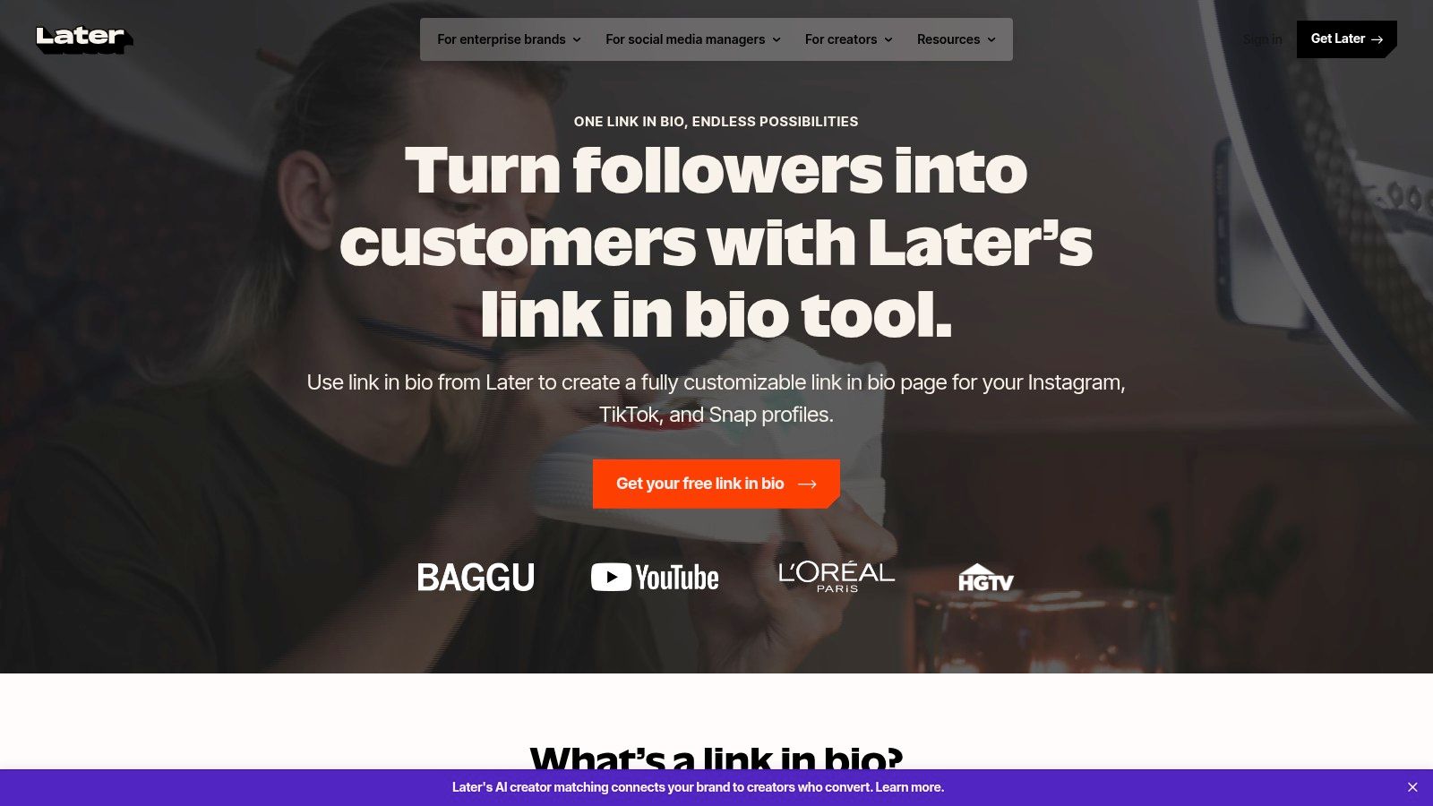
Later’s Link in Bio is the obvious choice for teams already using Later. On its own, it’s less compelling than some dedicated alternatives. Inside the Later ecosystem, it becomes much more useful.
That’s because the bio page connects directly to content planning and publishing workflows. A team managing Instagram and TikTok campaigns can tie links to posts, create a more shoppable or content-aware experience, and reduce manual work.
Where is Later strongest
This tool is best for brands and social teams that care about operational efficiency. If content scheduling already happens inside Later, adding a separate bio platform can create extra work for no real benefit. Keeping publishing, media linking, and page updates close together is often the smarter move.
It also suits e-commerce brands that rely on visual content. A product-driven page tied to posts usually performs better than a random list of “shop now” links with no visual context.
The downside is pricing logic. Later is a full suite, so it can be overkill for users who only need a better bio page.
Best fit
Choose Later Link in Bio when a team already runs scheduling and social planning in Later, especially for Instagram-led and product-led campaigns.
The platform is available at Later Link in Bio.
8. Flowpage by Flowcode — best Linktree alternative for QR-led campaigns
Flowpage is worth considering when the bio page is part of a larger QR strategy. That’s a narrower use case, but for event brands, retail campaigns, packaging, and offline-to-online funnels, it’s a practical one.
Its value comes from connecting QR codes and landing-page style destinations inside the same environment. That’s useful when traffic doesn’t just come from Instagram or TikTok, but also from posters, product inserts, booths, or printed collateral.
Why Flowpage matters for omnichannel campaigns
A standard bio tool usually assumes social-only traffic. Flowpage is better for brands that need one destination across physical and digital channels. A restaurant, event organizer, or consumer brand can use a QR code on-site and still direct people to a mobile-optimized page.
That unified setup is helpful for teams that want one place to manage brand presentation, landing links, and QR-linked campaigns without patching tools together.
For brands using packaging, signage, or in-person activations, QR integration can matter more than fancy page templates.
The tradeoff is that users who don’t need QR infrastructure may find Flowpage unnecessary. Its edge lies in campaign context, not in pure page aesthetics.
Best fit
Flowpage is best for brands running omnichannel campaigns where QR scans and mobile landing experiences need to work together.
The platform is available at Flowpage by Flowcode.
9. Bitly Pages — best Linktree alternative for marketers already using Bitly
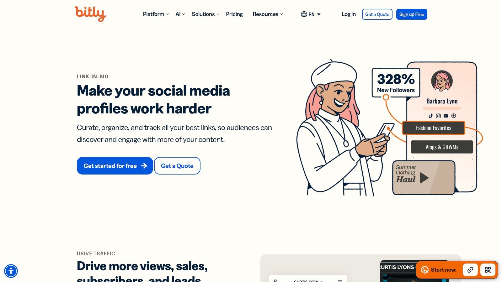
Bitly Pages is the practical recommendation for marketers who already live inside Bitly. If branded short links, referral tracking, and QR codes already run through Bitly, adding the bio page there keeps things centralized.
This isn’t the prettiest option on the list, and that’s fine. Bitly Pages is about control, analytics continuity, and workflow consolidation.
Who should choose Bitly Pages
Marketing teams, SaaS companies, and campaign managers often care more about link governance than visual flair. For them, Bitly Pages can be a better fit than a creator-first tool with prettier templates but weaker operational alignment.
That said, there’s a known trade-off in this category between the usefulness of the free plan and professional trust signals. Independent comparison coverage highlights how some platforms gate branding removal and deeper click visibility behind paid plans, including the limitations discussed in this analysis of branding and analytics tradeoffs. That’s worth considering for serious brand use.
Best for existing Bitly users: Keeps link tracking and page management in one place.
Best for campaign reporting: Useful when teams already rely on Bitly analytics.
Less ideal for premium brand presentation: Functional, but not especially distinctive.
Best fit
Bitly Pages is best for teams that already use Bitly as core infrastructure and want the bio page to fit that existing reporting and link management workflow.
The platform is available at Bitly Pages.
10. Solo.to — best Linktree alternative for a polished page with minimal setup
Solo.to is for users who want the page to look polished fast and don’t want to wrestle with a heavy builder. Its appeal is restraint. The defaults are clean, the setup is quick, and the pages usually look better than the average bio tool with less effort.
That makes it a good fit for creators and small businesses who want tasteful presentation without needing deep customization.
Why Solo.to is a smart minimalist option
Solo.to works because many users overbuild their bio pages. They add too many links, too many equal CTAs, and too many distractions. Solo.to naturally pushes the opposite direction. Cleaner defaults often lead to better focus.
It’s a strong option for photographers, freelancers, consultants, and creators who only need a few key destinations presented well. The page can feel professional without requiring much design labor.
The limitation is scope. Solo.to isn’t trying to be a creator commerce suite or agency platform. That’s fine, but buyers should be honest about whether they need a sleek profile page or a stronger conversion system.
Best fit
Solo.to is best for minimalists, personal brands, and small businesses that want a refined page with fast setup and don’t need a bigger ecosystem.
The platform is available at Solo.to.
Free Linktree Alternatives
Most tools on this list have a free tier, and the free tiers differ more than the paid ones do. The usual limits are the number of links, whether analytics are included, and whether the page carries the provider’s branding. Linktree’s own free plan is the benchmark most people compare against — here’s exactly what it includes, and what removing the branding costs. A fuller breakdown of what each free plan actually allows is in our guide to free link in bio tools.
Sites and Websites Like Linktree, Compared
Sites like Linktree fall into three groups. Link hubs (Lnk.Bio, Solo.to, Campsite) do the same job with a different look. Creator platforms (Beacons, Linkie) add selling, email capture and analytics on top of the links. Site builders (Carrd) drop the bio-page format and give you a real one-page site. Deciding which group you want removes most of the shortlist before you compare a single feature.
Top 10 Linktree Alternatives, Feature Comparison
Product | Core features | UX & analytics | Value proposition | Target audience | Pricing & tiers |
|---|---|---|---|---|---|
Linkie (recommended) | Drag/resizable cards, embeds, CTAs, email capture, custom domain, multi-profiles, direct Publer integration with auto-updating content (Publer) | Real-time + historical analytics, per-card engagement, smooth multi-profile switching | Unbranded, conversion-focused mini-sites with visual freedom, built-in measurement, and automatic freshness for Publer users | Creators, agencies, e‑commerce, SMBs, multi‑brand teams, Publer users | Free starter; Plus (advanced analytics, email, custom domains); Unlimited (free) profiles; |
Beacons | Drag-and-drop builder, store, tipping, email, media kit | Robust link & traffic analytics, mobile apps | All‑in‑one creator stack: monetize + manage audience from one place | Monetizing creators, influencers, and small commerce stores | Free + paid tiers for commerce/branding features |
Campsite | Sections, embeds, buttons, custom domains, multi-profile | Per-link analytics, UTM support, fast performance | Fast, polished pages with cost‑effective Pro upgrades | Creators and small teams want simplicity | Free + Pro with domains/expanded analytics |
Lnk.Bio | Templates, icons, 100+ embeds, mobile apps | Basic analytics, reliable uptime | Minimal, stable link pages with a lifetime payment option | Users wanting low‑maintenance, predictable cost pages | Free + paid; lifetime one‑time payment available |
Carrd | Full page builder, responsive controls, custom code, forms | GA support, multiple sites on Pro, performant | Highly customizable mini‑sites at low annual cost | Users wanting full design control and custom sites | Low‑cost annual Pro plans (per site/multi‑site tiers) |
Milkshake | Mobile app builder, card templates, socials, contact cards | Basic built‑in insights, mobile‑first | Fast mobile-first creation for social creators | Mobile-centric creators, TikTok/IG users | Free + affordable paid tiers for analytics/domains |
Later – Link in Bio | Link posts, featured media blocks, email capture, SEO | Integrated with Later analytics and scheduler | Link page tied directly to social publishing workflow | Teams already using Later for scheduling & publishing | Included in Later plans (pricing for full suite) |
Flowpage (Flowcode) | Links/media/contact sections, branding controls, QR pairing | QR + landing analytics inside the Flowcode dashboard | Omnichannel: QR codes + landing pages with unified analytics | Brands running physical campaigns, events, and packaging | Free + paid plans; enterprise features on higher tiers |
Bitly Pages | Build bio page, reuse Bitly links, QR code, scheduling | Bitly-grade tracking: views, clicks, geos, devices | Centralize short links, QR codes, and bio pages with enterprise analytics | Teams already using Bitly for link management | Part of Bitly plans; paid tiers for advanced features |
Solo.to | Clean templates, custom backgrounds, embeds, theming | Simple analytics, polished defaults | Fast, tasteful brand‑forward pages with minimal setup | Creators/small businesses wanting elegant pages | Free + clear paid tiers with custom domains and extras |
How to Choose Your Linktree Alternative
The best Linktree alternative isn’t the one with the most features. It’s the one that helps visitors make a decision faster. That’s the primary job of a bio page.
Many users leave Linktree for the wrong reasons. They assume they need more tools, more widgets, or more integrations. Usually, they don’t. They need better organization, better branding, and a clearer CTA hierarchy. A page with fewer, stronger choices almost always beats a page full of equal-priority buttons.
By 2026, the category had clearly shifted toward commerce, conversion tools, customer data, and broader marketing functionality, with platforms such as Beacons and HighLevel reflecting that move in Ecomm.Design’s market snapshot of Linktree alternatives. Pricing also shows how segmented the market has become. WPForms’ roundup lists options from low-cost tools like Carrd at $9/year, Linkie at $9/month, Taplink at $3/month, and Lnk.Bio at $0.99/month, alongside higher-priced conversion-focused platforms in its pricing comparison of alternatives. That range makes one thing clear. Buyers can choose between cheap link hubs and more serious conversion systems, but they shouldn’t confuse affordability with fit.
What to choose based on use case
Creators and personal brands: Linkie or Carrd make the most sense when the page needs to feel like a portfolio or branded landing page.
E-commerce brands and small businesses: Linkie or Beacons are stronger when lead capture, offers, and monetization matter more than simple links.
Agencies and multi-brand operators: Linkie or Campsite is better when switching between profiles, and keeping analytics separate matters.
Budget-first users: Lnk.Bio is hard to ignore for its low cost.
Social teams already using a suite: Linkie is especially strong for Publer users because its native integration lets teams publish content to social channels and choose whether that content appears on their Linkie page as well.
Frequently Asked Questions
Q: When should someone switch from Linktree?
A: The right time is when the page looks generic, key CTAs are getting buried, the brand presentation feels weak, or the current tool makes multi-profile management annoying. If the page doesn’t help visitors choose quickly, it’s time to move.
Q: Do fewer links really convert better?
A: Often, yes. Mobile visitors don’t want a menu of equal choices. They want a clear path. A focused set of visually distinct CTAs usually performs better than a long stack of similar buttons.
Q: Is migration difficult now?
A: Usually not. Most modern platforms make rebuilding a basic page easy. The bigger opportunity isn’t copying the old setup exactly. It’s using the move to improve link hierarchy, remove clutter, and create a cleaner mobile experience.
The right choice depends less on feature count and more on whether the page builds trust quickly, feels on-brand, and helps visitors act without hesitation.
A better bio page doesn’t need to be bigger. It needs to be clearer. For creators, brands, and agencies that want a page that feels more like a branded landing page than a button list, create a free Linkie page and test a cleaner layout in the Linkie playground.
Linktree Alternatives FAQ
What sites are like Linktree?
Beacons, Campsite, Lnk.Bio, Solo.to, Milkshake and Linkie all serve the same link-in-bio purpose. Carrd is the closest option if you want a one-page site rather than a link list.
Is there anything better than Linktree?
Better depends on the reason you are switching. For brand-consistent design, Linkie. For selling and email capture, Beacons. For the lowest cost, Lnk.Bio. For full design control, Carrd.
What are Linktree’s competitors?
The ten tools compared on this page are the main ones, spanning simple link hubs, creator platforms and one-page site builders.
Is there a free alternative to Linktree?
Yes — most of these tools offer a free plan. What separates them is link limits, analytics and provider branding. See free link in bio tools for the comparison.