Most link-in-bio pages fail in a painfully predictable way. They become a dumping ground for every offer, every platform, every old campaign, and every half-relevant link that felt important at the time.
That setup looks busy, but busy is not the same as effective.
When someone taps a bio link on Instagram, TikTok, YouTube, or a creator profile, they are showing intent. They want the next step. If the page forces them to sort through a cluttered stack of similar-looking options, clicks drop, attention scatters, and the visit dies.
A strong bio page works more like a lightweight landing page than a link list. It should guide action, not just display options. That means one clear goal, deliberate hierarchy, sharper CTA copy, visual cues that earn attention, and analytics that make weak spots obvious.
For anyone searching for how to optimize your link in bio, the answer is not “add more links.” It's the opposite. Cut the noise, control the path, and make every element earn its spot.
Start with a Single Goal, Not a Link Graveyard
Most bio pages try to do five jobs at once. Sell a product. Grow a newsletter. Push a new video. Book calls. Send people to every social profile. That approach creates a link graveyard.
A page with no priority tells visitors nothing about what matters most.
The first move is brutally simple. Pick one primary outcome. Not three. One. The page should either drive sales, collect email subscribers, book consultations, push content discovery, or send people to a launch. Anything else becomes secondary.

Pick the job before touching the design
A creator selling a course should not give equal visual weight to “Listen on Spotify,” “Follow on X,” “Read my blog,” and “Join the course waitlist.” That is bad prioritization disguised as completeness.
A coach booking discovery call should not lead with “My Website.” That sends warm traffic to a generic homepage instead of the booking path.
A musician pushing a release should not make fans dig through merch, old press, and unrelated profiles before they reach the new single.
Practical rule: If someone can't tell what the page wants them to do within a few seconds, the page is underperforming.
Use a ruthless filter
Every link should answer one question: Does this support the main goal right now?
A practical audit looks like this:
Primary action: The one result the page should drive most.
Supporting proof: Content that builds trust and helps the primary action.
Low-priority links: Nice to have, but not front-and-center.
Dead weight: Outdated launches, duplicate destinations, inactive offers, generic homepages.
That last category is where most pages fall apart. Old campaigns linger. Broken priorities stack up. Everything stays because deleting links feels risky.
It isn't.
Removing irrelevant links usually improves clarity faster than adding anything new.
What strong prioritization looks like
A clean bio page usually follows a simple order:
Primary CTA first
The main offer, signup, booking link, or launch destination.Proof second
A featured video, testimonial block, popular content piece, or product highlight.Secondary paths last
Social profiles, archive content, press mentions, and older resources.
This is the same logic used on strong landing pages. Attention gets directed before it gets diluted.
A bio page should answer one question clearly: what should this visitor do next?
That is the foundation. Without it, design tweaks and copy changes won't fix much.
Design Your Page for Action with Smart Hierarchy
Someone taps your bio after seeing a strong post. They are ready to act. Then they hit a page with 10 identical buttons, no focal point, and no clue where to look first. That click was earned. Bad hierarchy wastes it.
Once the goal is set, the layout decides whether the visitor moves or stalls.
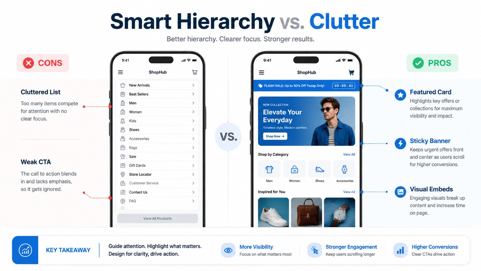
Give the top action the most visual weight
Your primary CTA should visually dominate the page. If your launch, lead magnet, product drop, or booking link looks the same as every other option, you have no hierarchy. You have a menu.
Make the top action impossible to miss:
Place it first: The highest-value action belongs above the scroll or as close to it as possible.
Increase contrast: Use stronger colors, larger text, or a card style that sets it apart from the rest.
Create breathing room: Spacing signals importance faster than decoration does.
Shrink secondary paths: Keep support links accessible, but stop giving them equal emphasis.
A fast audit test works well here. Blur the page or squint at it on your phone. If the first action does not stand out instantly, the hierarchy is weak.
Stop building pages that look like button spreadsheets
Uniform buttons kill momentum by forcing visitors to read every line and compare every option. That is work. People do not want to work from a bio page. They want a clear next step.
Strong link-in-bio pages use a micro-landing-page structure instead:
Weak layout | Better layout |
|---|---|
12 identical buttons | 1 featured CTA, then supporting blocks |
Generic homepage link | Specific destination tied to current campaign |
Old links mixed with new | Timely offer first, evergreen links lower |
Text-only links | Clickable images, embeds, or thumbnails |
Equal emphasis everywhere | Clear visual priority |
That structure mirrors the structure of high-converting landing pages. First, action; then, proof; then, lower-intent options.
Use visuals to pre-qualify the click
A good image does more than decorate the page. It tells the visitor what they are about to get.
Analysts at Linkfire found that visuals attract a meaningful share of clicks on link-in-bio pages, as noted in Linkfire's link-in-bio conversion research. That lines up with what shows up in audits. Product thumbnails, video stills, album covers, and creator headshots usually beat plain text links because they add context before the visitor reads a word.
Use visuals where clarity matters most:
Product cards for items people can buy now
Video thumbnails for tutorials, interviews, or latest uploads
Lead magnet graphics for downloads and free resources
Promo banners for deadlines, launches, or limited offers
The page should be scannable in a single pass. Visual blocks help visitors quickly sort options.
Build a visual path, not a pile of links
A good hierarchy leads the eye in order. Top offer first. Proof next. Supporting options after that. Social links and archive content belong at the bottom because they rarely drive the highest-value action.
For creators and brands using no-code tools, drag-and-drop card layouts in Linkie make it easier to build that structure because cards can be reordered and grouped without rebuilding the whole page.
Useful page elements include:
Featured content cards for the main offer
Embedded media that previews the content before the click
Short proof sections with testimonials, press logos, or bestseller tags
Sticky promo banners for urgent campaigns
Branded section labels that separate offers from low-priority links
Here is the standard I use in audits. A visitor should know where to click within a few seconds, and the layout should make that choice feel obvious.
The best link-in-bio pages do not behave like directories. They behave like compact landing pages built to move one person toward one clear action.
Write Microcopy That Actually Converts
Design gets attention. Copy gets the click.
Most bio page copy is lazy. “My Website.” “Learn More.” “Click Here.” “Latest Video.” None of that tells the visitor what they get, why it matters, or why they should care now.
Good microcopy removes ambiguity. It makes the benefit obvious, and the action feels easy.
Weak copy sounds like navigation
Visitors do not arrive at a bio page looking for generic labels. They arrive because some piece of content created curiosity.
The copy should continue that momentum.
Here's the difference:
Weak CTA | Stronger CTA |
|---|---|
My Website | Shop the New Collection |
Learn More | See the Pricing and Packages |
Latest Video | Watch the Full Tutorial |
Newsletter | Get Weekly Creator Tips |
Book Now | Book a Free Discovery Call |
Shop | Grab the Limited Drop |
The stronger version does two things. It names the action and signals the payoff.
Write for the visitor, not for the brand owner
Most bad CTA copy is self-centered. It labels what the brand owns, not what the visitor gets.
“My Podcast” is the owner's language.
“Listen to the New Episode” is user language.
“My Freebie” is the owner's language.
“Download the Content Calendar” is user language.
That shift sounds small, but it changes how people process the click.
A simple microcopy formula
A practical CTA formula looks like this:
Verb + outcome + context
Examples:
Download the launch checklist
Watch the full breakdown
Book a strategy call
Shop the spring drop
Join the email list
Get the free template
If the link needs a little extra push, add specificity underneath the button or card. A one-line description can do a lot of work.
For example:
Book a Free Discovery Call
Best for founders who need a faster content systemGet the Creator Pricing Guide
A quick breakdown for brand deals and retainers
Generic CTAs create hesitation. Specific CTAs create momentum.
Common microcopy mistakes
A few patterns show up constantly on underperforming pages:
Vague labels: “Resources,” “Links,” “Offers”
No benefit: the visitor can't tell what happens next
Too many soft verbs: “Discover,” “Explore,” “Check out”
Mismatched tone: aggressive sales copy on a trust-first audience
Duplicate CTA wording: different destinations that all sound the same
The fastest fix is usually rewriting the top CTA and the first few supporting actions. That often improves clarity more than a visual redesign.
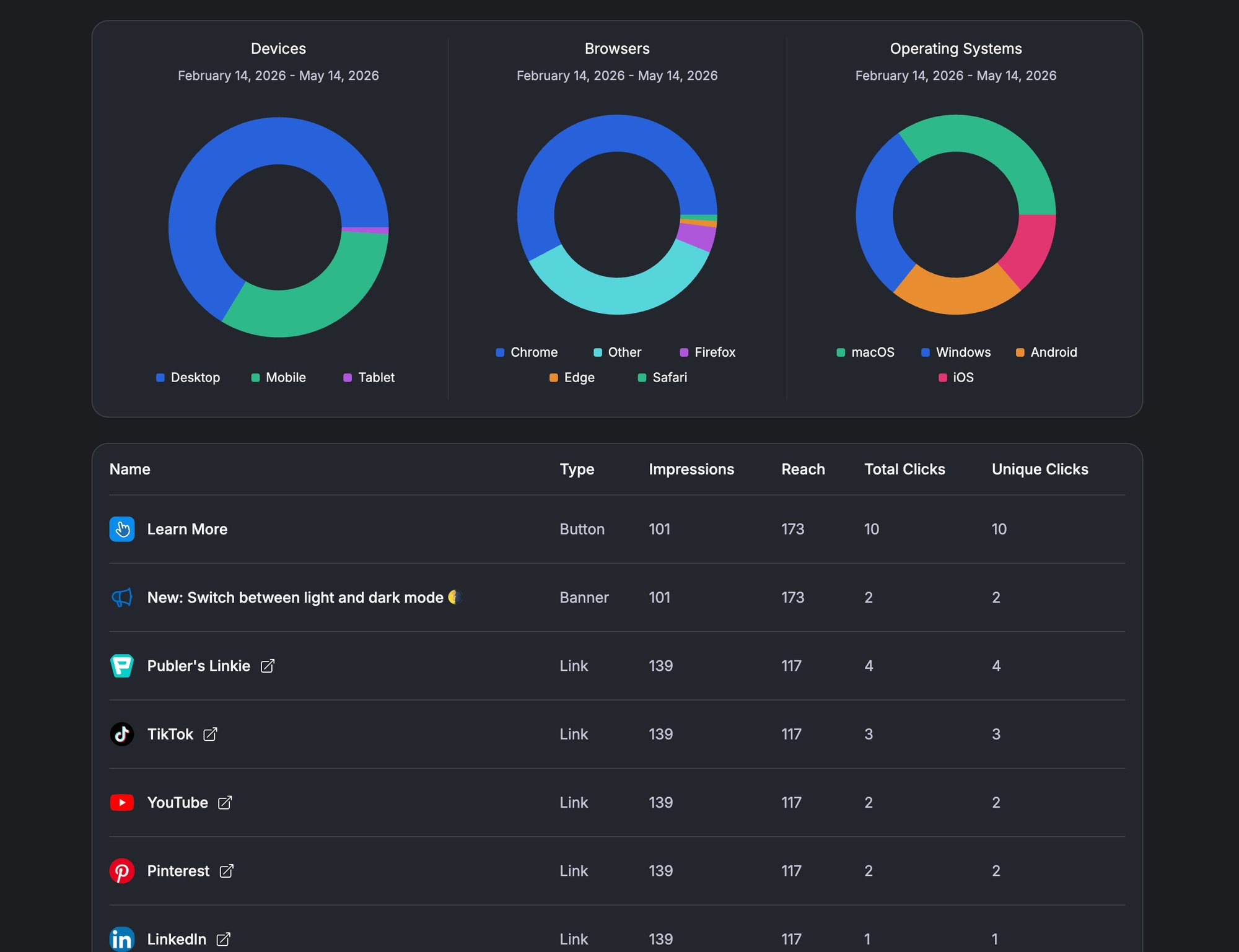
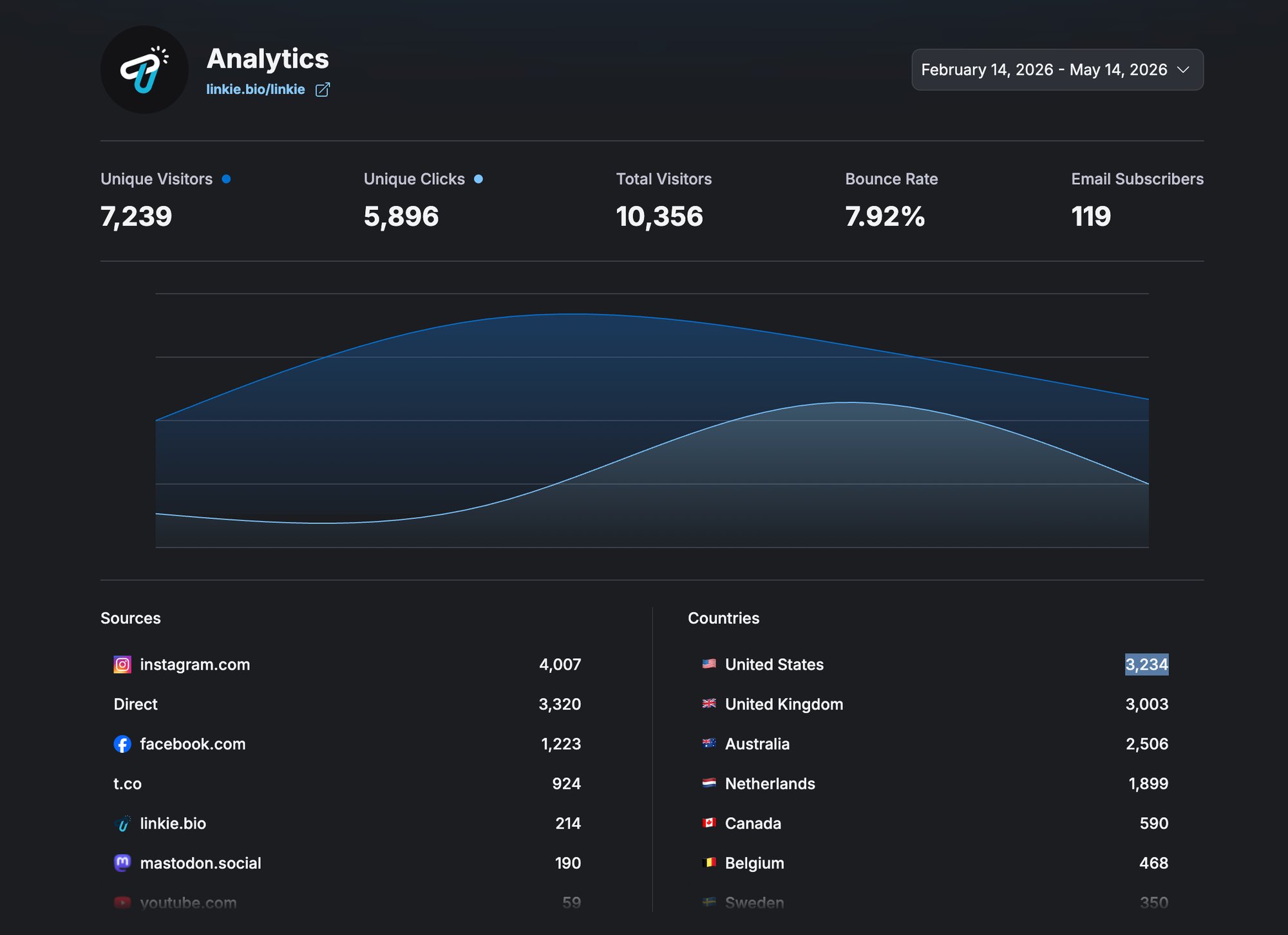
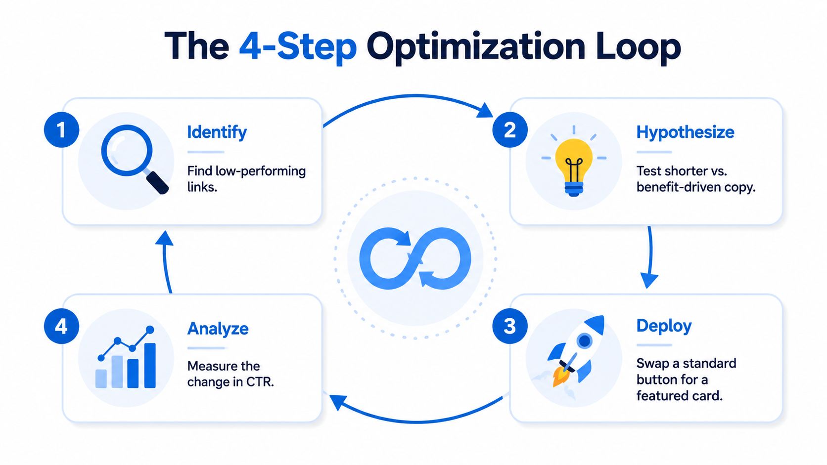
Use Analytics to Find What's Working and What Isn't
A weak link-in-bio page usually does not look broken. It looks busy, acceptable, and hard to diagnose. Then you check the numbers and find the underlying problem. The hero CTA is ignored, older links keep siphoning clicks, and campaign traffic lands on a page that doesn't match the post's promise.
That is why I audit bio pages like micro-landing pages, not link collections. Analytics should tell you where attention goes, where intent drops, and which element deserves the top spot.
What the numbers usually mean
Start with behavior, not vanity metrics.
A high bounce rate usually means the page feels irrelevant or confusing. The visitor clicked from a post expecting one thing and landed on a page asking them to sort through five others.
A low click-through rate on the first CTA indicates a priority issue. Either the offer is not compelling, or the page visually tells people to look elsewhere.
Scroll depth and lower-link clicks matter too. If people keep skipping the action you want and choosing a lower item, your page hierarchy is losing the argument.
Track the metrics that help you make changes
The useful metrics are simple:
Unique clicks: How many visitors engaged
Total clicks: Whether certain links attract repeat interaction
Per-link or per-card engagement: Which blocks win attention
Bounce rate: Whether the page feels clear or mismatched
Traffic source patterns: Which channels send visitors with real intent
As noted earlier, smaller link sets usually outperform cluttered pages. The same principle applies in analytics. Fewer options make performance easier to read, and they make underperformers easier to cut.
Use analytics to diagnose, not just report
A good audit does not stop at “this link got 42 clicks.”
It asks sharper questions:
Is the top CTA getting first-click attention or being skipped?
Are expired promos still taking up prime real estate?
Do visual cards outperform plain text links for this audience?
Is one campaign sending traffic that bounces more quickly than the others?
Are secondary actions pulling attention away from the one action that matters most?
For creators and agencies looking to build a more disciplined review process, this AI-powered influencer strategy playbook is a useful companion resource, as it frames audits around decisions rather than vanity metrics.
A platform with link-in-bio analytics features should make this review easy at the card level and traffic-source level. Pageviews alone are not enough.
Watch a real builder in action
A live demo helps clarify how modern bio pages function more like lightweight landing pages than old-school button lists.
What should get changed first?
Do not start by tweaking everything. Fix the obvious bottlenecks in order.
Fix the top CTA
If the main action is underperforming, start there. Nothing below it matters more.Delete ignored links
Low-click clutter weakens decision-making and hides your best offer.Promote proven winners
If a lower card keeps earning clicks, move it up and give it more visual weight.Match the page to live campaigns
Social traffic converts better when the page continues the exact promise made in the post, Story, or video.
Analytics should answer one blunt question: what deserves more visibility, and what should be removed?
That is the shift from a passive bio page to a page that earns clicks on purpose.
Run Simple AB Tests for the Fastest Wins
A/B testing sounds more complicated than it is.
For a bio page, the fastest wins usually come from changing one obvious variable and watching what happens. There is no need for a giant experiment roadmap. Start with the elements that shape attention first.
Test what visitors notice first
A structured A/B testing framework can deliver a 15% to 30% uplift in conversions when it focuses on high-impact elements like headlines, CTAs, and layouts, according to InfluenceFlow's guide to Instagram link-in-bio tools.
That result makes sense because the first visible choices usually drive the page.
The most effective tests are usually:
CTA hierarchy
Featured card first versus standard button firstCTA wording
“Book a Call” versus “Book a Free Discovery Call”Promo placement
Sticky banner versus regular cardVisual treatment
Clickable image versus text-only link
One variable at a time
Many creators ruin tests by changing too much at once.
If the copy, layout, color, or destination changes, the result means nothing. No one knows what caused the lift or the drop.
A clean test changes one thing:
Test type | Version A | Version B |
|---|---|---|
Top CTA copy | Join the Newsletter | Get Weekly Creator Tips |
First section | Featured product card | Featured video card |
Promo placement | Banner at top | Promo card below intro |
CTA style | Plain button | Visual card with thumbnail |
That's enough.
Keep the test practical
A good test setup is boring on purpose:
Choose one goal.
Change one element.
Let it run long enough to gather behavior.
Review clicks and bounce patterns.
Keep the winner. Test again.
That process works whether the page belongs to a solo creator, a musician launching a release, or a small agency managing brand campaigns.
For anyone who wants a simple analogy outside bio pages, PledgeBox email marketing A/B testing is a useful reference because the same rule applies. Test one meaningful variable, then keep the winning version.
Good testing is not about being clever. It is about being disciplined.
The fastest tests to run this week
The easiest wins usually come from three experiments:
Rewrite the first CTA
Replace a vague label with a benefit-led one.Move the most important action higher
If the current goal is buried, fix that first.Swap a flat button for a visual card
Especially for products, media, or lead magnets.
These are not dramatic changes. That is why they work. They are easy to launch and easy to measure.
A page does not need to be rebuilt every week. It needs a steady habit of testing the parts that shape action.
Quick Optimization Checklist and Use-Case Templates
A good bio page is usually built from a few disciplined decisions, not a long list of hacks.
The checklist below works for creators, coaches, ecommerce brands, startups, freelancers, musicians, and small teams. The templates after that make the setup more concrete.
Quick optimization checklist
Choose one primary goal
Sales, signups, bookings, content discovery, or community growth. Pick one.Trim the page hard
Remove outdated launches, duplicate links, and generic homepage routes.Keep the structure tight
Use only the links and cards that support the current goal.Lead with the strongest CTA
The first visible section should be the action that matters most.Use visuals where they help
Product thumbnails, video previews, and featured cards usually outperform flat text lists.Rewrite weak labels
Make button copy specific and benefit-led.Review analytics regularly
Promote what gets clicks. Cut what gets ignored.Refresh the page with campaigns
If social content changes, the bio page should change too.
Template for creators and musicians
A creator page should help visitors binge, subscribe, or buy without confusion.
A simple layout:
Featured content block
Latest video, release, or spotlight postPrimary growth CTA
Newsletter signup, membership, or merch dropSocial proof or media embed
Video preview, playlist, or fan-favorite contentSecondary links
Spotify, YouTube, TikTok, Instagram
For creators building audience-first pages, Linkie's influencer use case shows the kind of structured setup that fits this model.
Template for brands and e-commerce shops
A brand page should sell with less friction.
A practical structure:
Top featured product or collection
Seasonal promo or limited-time banner
Product category links
UGC, reviews, or proof content
Support links are lower on the page
The biggest mistake here is sending paid or social traffic to a homepage rather than to the exact collection or product being promoted.
Template for agencies and service businesses
An agency or freelancer does not need a page full of random links. It needs a decision path.
A clean service layout looks like this:
Section | What goes there |
|---|---|
First block | Book a call or request a proposal |
Second block | Short authority proof, portfolio, or case examples |
Third block | Lead magnet or pricing guide |
Final block | Social profiles and general website link |
For agencies handling multiple client profiles, isolated analytics matter. Multi-profile tools can improve agency efficiency by up to 40% via consolidated dashboards, according to Liinks' article on advanced link-in-bio analytics. That matters because client reporting gets messy fast when data mixes across accounts.
Agencies need separation, not just convenience. Mixed analytics create bad decisions.
The right template depends on the business model. The principle does not change. One goal first. Clear path. Less clutter.
Frequently Asked Questions
How many links should a bio page have
Fewer than many think.
A practical target is 3 to 7 links, which aligns with the industry guidance cited earlier. That range forces prioritization and reduces overload. Once a page grows past that, most visitors stop deciding and start skimming.
If there are more things to show, group them visually or demote them lower on the page. Do not give every option equal prominence.
How often should a link-in-bio page be updated?
It should be reviewed whenever the active campaign, launch, or traffic goal changes.
For most creators and brands, that means a quick audit at regular intervals tied to content publishing and promotions. A stale page usually shows obvious signs. Old links remain live, the featured CTA no longer aligns with the latest content, and the page feels increasingly disconnected from current posts.
The update does not need to be dramatic. Often, it is just reordering a few cards, swapping the top CTA, and removing links that are no longer relevant.
Should a brand use a custom domain for its bio page
Usually, yes, if brand trust matters.
A custom domain makes the page feel more intentional and more aligned with the rest of the brand experience. That matters for agencies, consultants, startups, ecommerce brands, and anyone pitching clients or partners. It also helps avoid the feeling that the page is just another generic profile tool.
For early-stage creators, a standard short link is fine if the page itself is clear and branded well. The custom domain becomes more valuable as the bio page starts acting like a real landing page rather than a temporary utility.
A clean, focused bio page can do far more than hold links. It can sell, qualify traffic, grow a list, and route visitors to the right action with far less friction. For anyone ready to build or test one, Linkie offers a free way to create a branded link-in-bio page, and the Linkie playground makes it easy to try layouts before publishing.