Most advice about Instagram bio clicks is backward. It tells people to add more links, sprinkle in “link in bio,” and hope volume solves the problem.
It usually does the opposite.
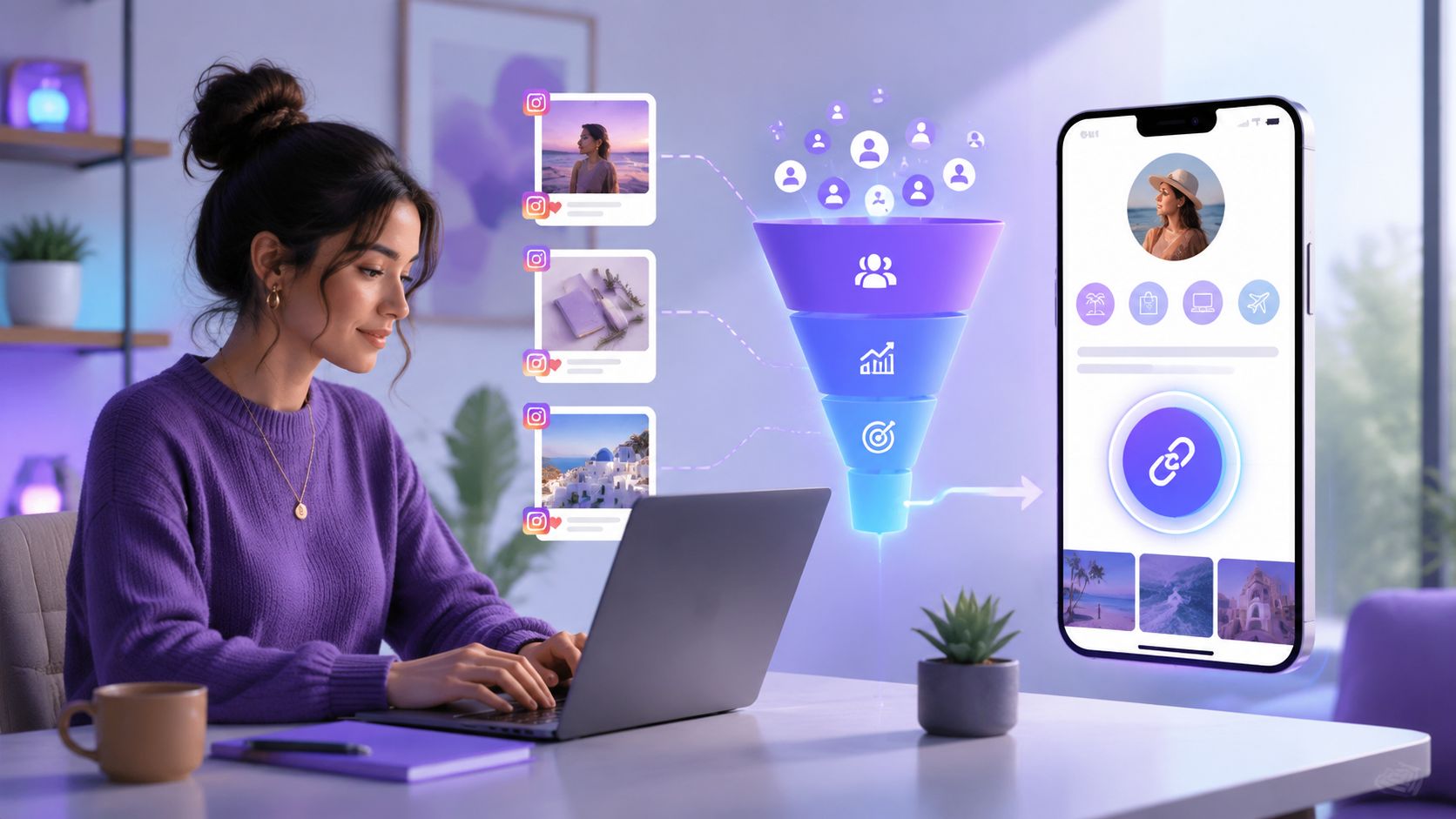
The people who get more clicks from Instagram bio setups don't treat that profile link like a storage bin. They treat it like the entrance to a funnel. The profile copy sets the promise. The content pre-sells the click. The link page removes friction. The analytics expose where people hesitate and leave.
That's the difference between a bio that looks active and a bio that converts.
Why Your 'Link in Bio' Is Probably Leaking Clicks
Most Instagram profiles don't have a traffic problem. They have a decision problem.
A visitor lands on the profile, scans a vague bio, taps a generic link, and hits a page with too many equal-priority options. That's where the click dies. Not because the audience is bad, but because the path is messy.
That waste shows up in the performance gap. In 2026 guidance, average Instagram bio-link click-through rates were reported at about 2 to 4%, while top-performing accounts reached 8 to 10% according to Molly Cahill's Instagram click-through guidance. That's not a small difference. It means many profiles are sending traffic into a weak funnel.
The real job of a bio link
Instagram gives profiles one main clickable gateway. That changes the strategy.
The goal isn't to “have a link.” The goal is to make that one link feel like the obvious next step for the exact person who just visited. If the profile promise is broad, the click feels optional. If the destination is cluttered, the click feels like work.
Practical rule: Every Instagram bio should answer two questions fast. Who is this for, and what happens after the tap?
Many creators falter by prioritizing self-expression over user intent. A bio full of personality can still underperform if it doesn't make the next action clear.
What usually kills clicks
A leaking bio funnel usually has one or more of these problems:
Vague profile copy that says who the creator is, but not what the visitor gets
Generic CTA language like “check my links” that gives no reason to act
Static destinations that ignore current content, launches, or offers
Crowded link pages where every button fights for attention
No continuity between the Reel, Story, caption, bio, and landing page
The fix isn't glamorous. It's alignment.
When the content promise matches the bio CTA, and the bio CTA matches the landing page, clicks get easier. When those pieces don't match, Instagram traffic leaks at every handoff.
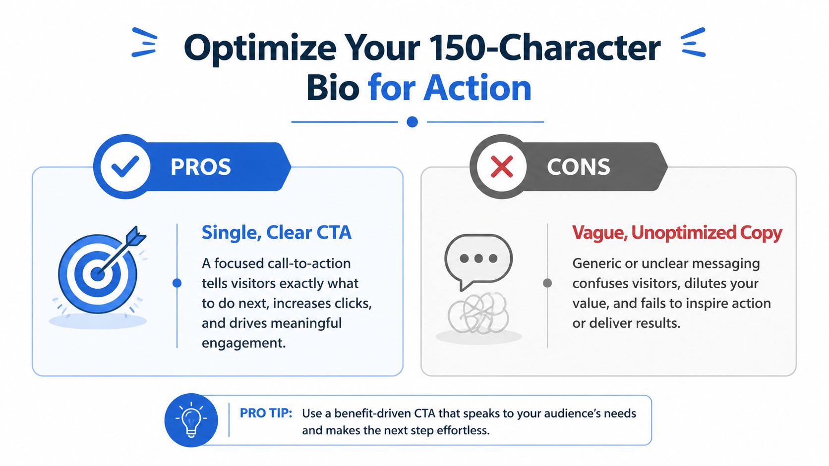
Optimize Your 150-Character Bio for Action
Instagram bios are short enough that every weak word costs something. The platform's 150-character limit forces clarity, which is useful if the goal is clicks instead of cleverness.
A strong bio usually does three jobs in order: it hooks the right person, states the value, and gives them a reason to tap now.
A simple bio formula that works
Use this structure:
Hook
Identify the audience or problem fast.Value proposition
Explain what kind of result, resource, or content they'll get.CTA
End with a direct action tied to an outcome.
The biggest mistake is ending with a lazy CTA. “Check my links” makes the visitor do interpretive work. Specific prompts perform better because they reduce uncertainty.
Examples of stronger CTA language:
Get the exact tools used daily
Shop the products from today's reel
Start with the free guide
Book the current offer
Watch the full tutorial
Generic CTAs force people to guess. Specific CTAs let them self-qualify.
What to remove from the bio
A lot of bios are packed with filler that sounds nice but doesn't move anyone.
Cut things like:
Overbuilt credential stacks unless they directly support the offer
Multiple audience types that make positioning fuzzy
Abstract brand language that doesn't say what the page helps with
Competing calls to action inside the bio itself
For more examples of tight bio messaging, this breakdown on optimizing your profile with Gainsty is worth reviewing, as it focuses on small copy changes that sharpen user intent.
A practical rewrite lens
Instead of writing the bio from the creator's perspective, write it from the visitor's next question.
A weak version:
Creator, marketer, founder
Sharing tips, tools, and updates
Check my links
A stronger version:
Content systems for creators and small brands
Tutorials, tools, and launch resources
Get the exact tools from recent posts
That shift sounds subtle, but it changes the click from curiosity to intent.
For anyone comparing destination tools before rewriting the profile CTA, this guide to the best link-in-bio tools clarifies which kind of destination page the bio sends people to.
Design a Link Page That Actually Converts
The click from Instagram isn't the finish line. It's the audition.
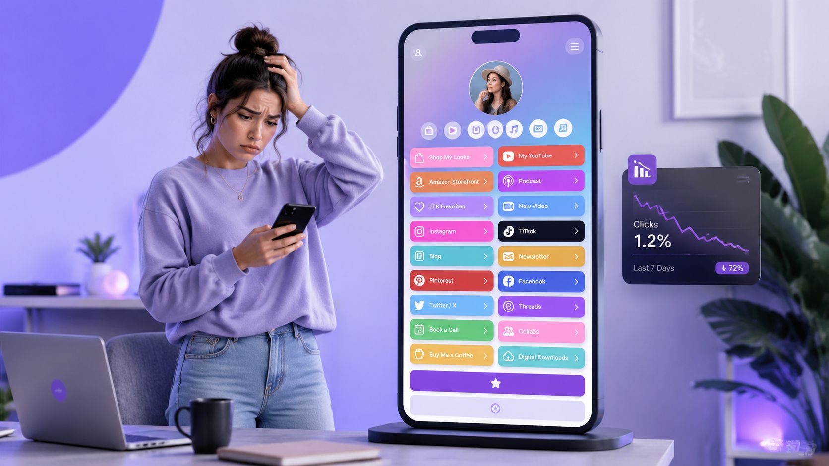
A lot of creators finally earn that tap, then waste it with a page that looks like a junk drawer. Ten buttons. No hierarchy. Mixed offers. No visual signal about what matters most. Visitors don't read that page carefully. They scan it, hesitate, and leave.
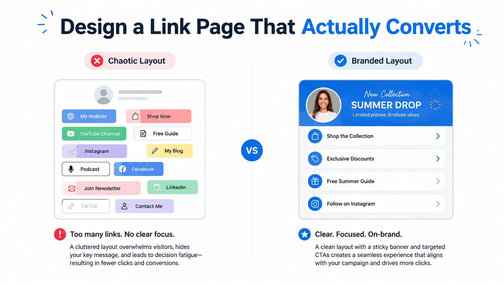
The before and after
The low-converting version usually looks familiar:
a long stack of text-only links
old campaigns still sitting near the top
podcast, shop, freebies, affiliate links, YouTube, newsletter, and contact links are all competing at once
no visual continuity with the Instagram profile
The stronger version is narrower. One primary action sits above the fold. One secondary action supports it. Everything else is pushed lower or grouped by intent.
That's not minimalism for aesthetic reasons. It's conversion logic. If every option looks equally important, none of them feels important.
Visual hierarchy drives clicks
The landing page should guide the eye before it asks for a decision. That's where media blocks help.
According to Linkfire's analysis of link-in-bio conversions, 25% of link-in-bio clicks are driven by images, and 28% come from video blocks. That's the clearest argument against bland text lists. People respond to visual cues faster than they process stacked buttons.
A better page usually includes:
One featured offer at the top with a clear image or thumbnail
Button text tied to outcome instead of generic labels like “click here”
Embedded media, when the offer benefits from proof, preview, or demonstration
Spacing and grouping so related actions feel intentional, not random
The first screen of a link page does most of the work. Treat it like campaign real estate, not archive storage.
What a branded structure looks like
A page should feel like an extension of the Instagram account that sent the visitor there. Same message, same campaign, same emotional context.
For temporary offers, a short branded link can help keep shared URLs cleaner. Teams that want cleaner redirects or campaign links often use resources like this EvergreenFeed Bitly tutorial before plugging those links into a bio page.
Platforms differ here. Some only offer simple lists. Others support layout control. Linkie is one option that supports branded pages with draggable cards, thumbnails, embeds, sticky banners, and cleaner CTA organization, making it easier to match a page to current campaigns rather than maintaining a static list. There's also a practical walkthrough on how to optimize your link in bio for anyone reworking page hierarchy.
Use Content to Funnel Traffic to Your Bio
Instagram bio clicks don't come from the bio alone. They come from content that creates a reason to visit the profile in the first place.
That's why “link in bio” underperforms when it appears as a reflex. It doesn't carry enough context. A better prompt connects the click to a specific outcome from the post, Reel, or Story someone just consumed.
Oneupweb documented the difference clearly. In a case study, Instagram posts that explicitly directed users to the bio link averaged 5.72 users per profile, compared with 1.3 when posts didn't, resulting in a 4.4x increase in profile visits, according to Oneupweb's link-in-bio strategy case study.
Build content-specific loops
The best traffic-driving content creates an open loop and closes it on the destination page.
Examples:
Reel to resource
A short tutorial shows the result, then the caption points people to the exact checklist, template, or product collection in the bio.Story to offer
A Story sequence creates urgency around a launch, booking window, or product drop, then pushes viewers toward the profile for the next step.Carousel to deeper explanation
The post teaches part of the idea, but the linked page contains the expanded tutorial, tools, or examples.
This works because the click feels like a continuation rather than an interruption.
Highlights are part of the funnel
Many profile visitors check Highlights before they click the bio link. That behavior matters.
Helpful Highlight categories include:
Start here for new visitors
Tutorials for educational creators
Products for e-commerce brands
Results for coaches, consultants, and service businesses
FAQ for people who hesitate before booking or buying
Those Highlights should answer the objections that stop clicks. What is this offer? Who is it for? Is it worth tapping through?
A useful walkthrough on Story-driven traffic is below.
Better caption prompts
Weak prompt:
link in bio
Stronger prompt:
Tap the bio link for the full product list from this reel
The template mentioned in slide six is on the bio page
The full walkthrough is in the top link on the profile
A strong Instagram CTA doesn't ask for a click. It explains why the click is worth taking now.
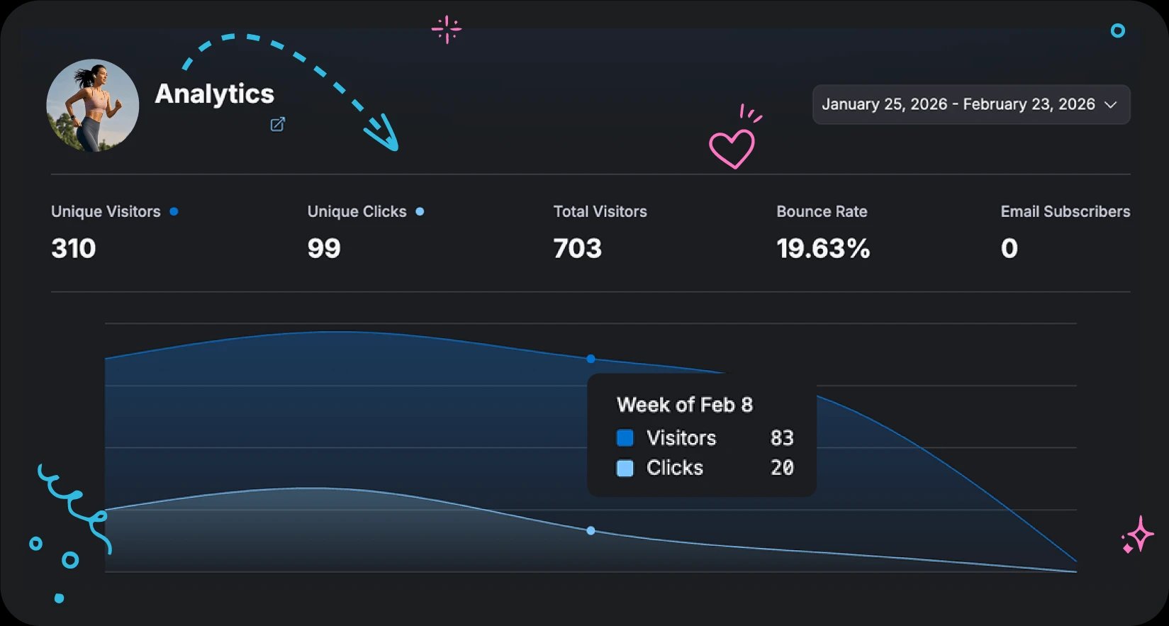
Measure and A/B Test Your Way to More Clicks
More clicks without context can hide problems. A spike in traffic means very little if visitors bounce, ignore the main CTA, or click the wrong thing.
The useful question isn't “How many clicks happened?” It's “Where did the funnel lose intent?”
Pensight's guidance on testing makes the point well. The strongest gains come from disciplined CTA testing and ongoing measurement, not from adding more links. Tracking visitor sources, button clicks, and per-card engagement is critical for identifying funnel weaknesses, as outlined in Pensight's link-in-bio A/B testing guide.
The metrics that matter
Start with a short list:
Click-through rate tells whether the profile and CTA are convincing enough to earn the tap
Bounce rate shows whether the landing page is confusing, mismatched, or too cluttered
Per-link engagement reveals what people want once they arrive
Traffic source data helps connect specific content formats to downstream actions
If the bio gets profile visits but weak clicks, the profile copy or CTA is the issue. If the link page gets visits but weak engagement, the landing experience is the issue. If one card gets attention and everything else gets ignored, that's a useful signal, not failure.
A simple testing rhythm
Keep testing narrow. Change one variable at a time.
Try this sequence:
Test the bio CTA copy
Compare a generic prompt against an outcome-driven one.Test the top card headline
Change the primary offer, not the whole page.Test card order
Move the current campaign above the evergreen links.Test media format
Swap a plain text card for an image-backed or video-supported card.
A practical analytics dashboard makes this easier by connecting behavior to layout decisions. Tools with built-in reporting, such as Linkie analytics, make it easier to compare visitor sources, button activity, and page engagement without guessing.
What not to test
Don't change the bio, CTA, card order, headline, and offer all at once. That produces noise, not insight.
Small controlled tests beat dramatic redesigns because they show what actually changed behavior.
Instagram Bio Link FAQ
A few questions come up repeatedly once the core setup is in place. Most of them come down to timing, trust, and how to handle temporary campaigns without wrecking the whole page.
Common Questions About Instagram Bio Clicks
Question | Answer |
|---|---|
How often should the bio link change? | It should change when the campaign, offer, or content theme changes. Static links usually underperform when the profile is actively promoting different things. The destination should match what recent posts are asking people to do. |
Should the bio CTA stay the same all year? | No. The CTA should reflect the audience's current intent. A creator pushing a tutorial series needs different CTA language than a coach promoting a webinar or a brand launching a product drop. |
Is a custom domain worth using? | Usually, yes. A custom domain can make the link look more brand-consistent and professional. It also reduces the feeling of sending people to a generic third-party page. |
How many links should go on the page? | Fewer than most people think. The right number depends on the audience and offer mix, but the page should clearly prioritize one main action and one supporting action above the fold. |
Should old promotions stay on the page? | Only if they still support a current conversion goal. Expired launches, old webinars, and outdated freebies create hesitation and dilute attention. |
What's the best way to feature temporary promos? | Use a format that adds visibility without disrupting the full page structure. Sticky banners work well for time-sensitive launches, flash offers, event signups, or new drops because they can spotlight urgency while leaving the main hierarchy intact. |
Do Highlights still matter if the bio is strong? | Yes. Many visitors use Highlights to verify credibility, understand the offer, or answer objections before clicking. Good Highlights support the bio. They don't replace it. |
What's the first thing to fix if clicks are weak? | Start with alignment. Make sure the recent content, bio CTA, and top destination card all point to the same action. Most underperforming profiles have a messaging mismatch before they have a traffic problem. |
A clean Instagram funnel doesn't need more noise. It needs sharper intent, a clearer hierarchy, and regular updates that align with what the audience is already responding to.
Creators, brands, and agencies that want a cleaner way to organize Instagram traffic can create a free page with Linkie and test layouts, cards, and CTA structure in the Linkie playground.