Your TikTok bio link is leaking conversions because most advice about the best link in bio for TikTok is backward. It treats the bio page like a storage closet for every offer, every platform, and every side project. That approach works badly on TikTok.
TikTok traffic moves fast. People tap from a video because they want one thing right now. If the first screen shows a pile of equal-weight buttons, old promos, and vague labels, they leave. Independent guides consistently frame link in bio as a single destination that can hold multiple calls to action, which matters more on TikTok because attention is concentrated in one profile link rather than spread across a full profile ecosystem like on other platforms, as outlined in Later's link in bio overview.
TikTok also creates a practical setup issue that many creators miss. The clickable website field often depends on the account type. Tutorials commonly point users to switch to a Business account before the website option appears, which is why many creators keep asking why they can't add a link at all, as noted in this TikTok bio link walkthrough.
That's why the best link in bio for TikTok isn't the one with the most features. It's the one that helps creators place the right CTA above the fold, update it quickly when a post starts moving, and remove anything that distracts from the next action.
1. Linkie
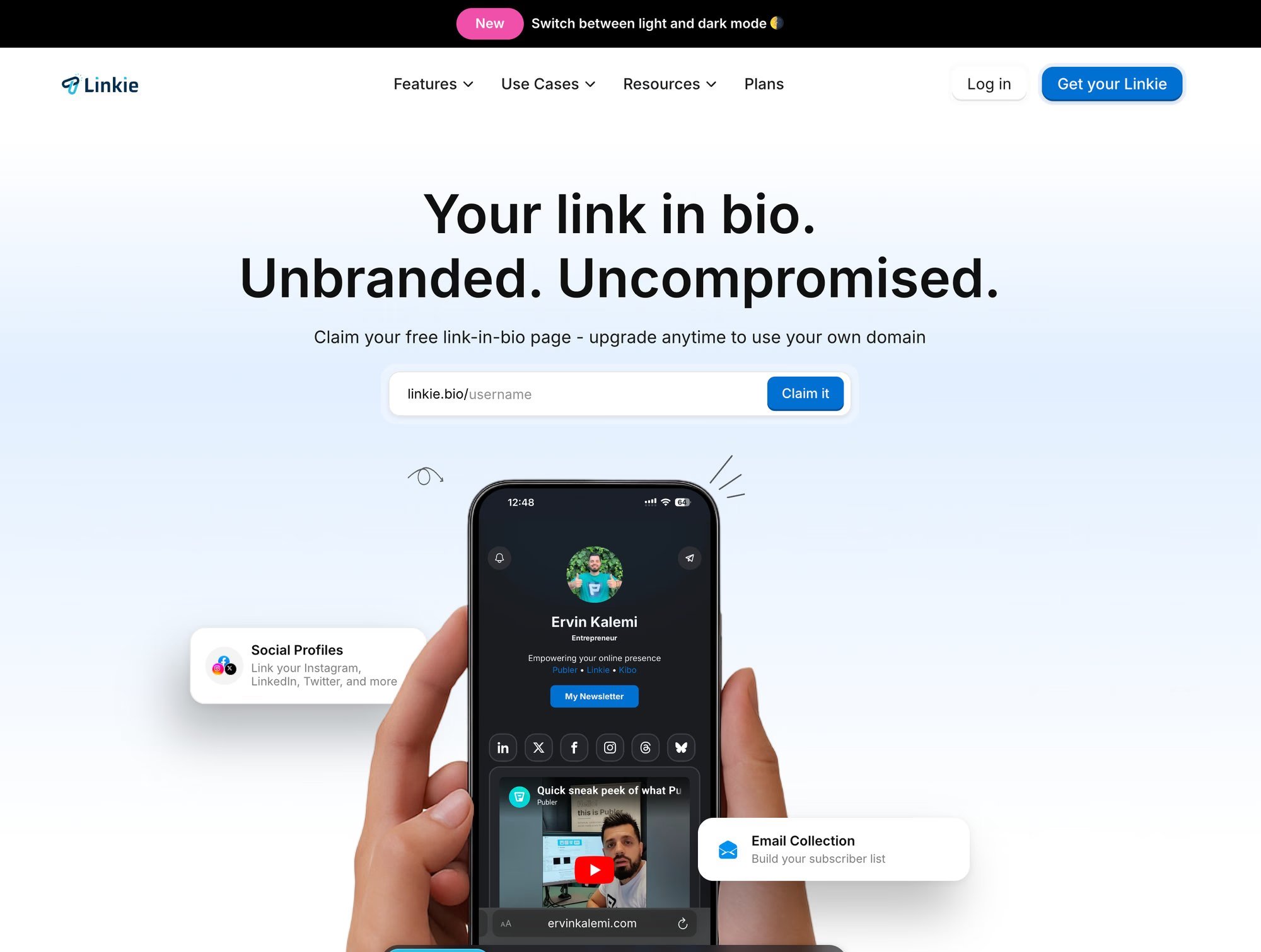
Linkie stands out because it lets creators control attention, and that is the whole job on TikTok.
Fast TikTok traffic does not read a bio page like a menu. It scans the first screen, decides in a second or two, and either taps or leaves. Linkie is better suited to that behavior than the standard stack of identical buttons. You can put one offer in a dominant position, shrink lower-priority items, and structure the page around the action you want now.
That matters more than having room for twenty links.
Why Linkie fits TikTok traffic
The practical advantage is the layout hierarchy. Draggable cards, resizable blocks, embeds, product links, and sticky promos make it easier to build a page around a single CTA rather than treating every destination equally. If a product video is taking off, the page can push that product first. If a lead magnet is the goal this week, the page can shift just as fast.
I have found that this kind of control usually beats a prettier version of the same old link list. TikTok visitors arrive with intent, but not much patience. The page must immediately clarify the next step.
Linkie also gives creators useful performance signals, not just surface-level clicks. Seeing bounce rate, traffic source, button activity, card engagement, and subscriber growth helps diagnose the underlying problem. Sometimes the issue is not weak traffic. It is a weak first screen, a vague CTA, or too many competing actions.
Practical rule: Give the first screen one job. Buy, sign up, book, or watch. If visitors have to sort through multiple equal-priority choices, conversion usually drops.
Another strength is account management. Linkie works well for creators running more than one brand, or for agencies managing separate profiles, because switching between properties and reading distinct analytics is straightforward.
Best use cases for Linkie
Selling from a hot TikTok post: Put the featured product first, then add proof, FAQs, or supporting links below it.
Capturing leads: Add email capture near the top to avoid extra steps.
Rotating campaigns quickly: Update the top banner or primary card as soon as a new video starts pulling traffic.
Keeping stronger branding: Custom domains and unbranded pages make the experience feel owned rather than rented.
The trade-off is clear. Some of the stronger options, including advanced analytics, custom domains, and email capture, are available only in paid plans. It is also not a full checkout system, so creators selling physical or digital products may still need Shopify, Stripe, or another checkout layer behind the bio page.
For creators who care about CTA clarity, fast updates, and tighter control over what shows above the fold, Linkie is a strong fit.
2. Linktree
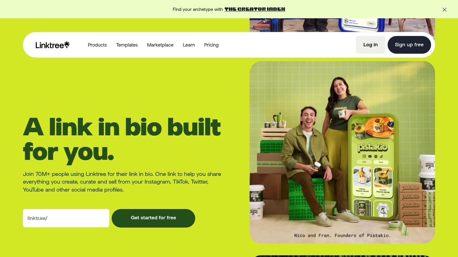
Linktree is still the default choice for many creators because it's familiar and easy to set up. There's a reason it shows up everywhere. Linktree is reportedly used by more than 70 million creators and brands across TikTok, Instagram, and other channels, according to Influencer Marketing Hub's TikTok link-in-bio guide.
That scale also creates the downside. A lot of Linktree pages look and behave the same. On TikTok, sameness usually loses. Fast traffic wants a clear path, and default link stacks often flatten every offer into the same visual weight.
Where Linktree works well
For solo creators who need something live today, Linktree is still a solid option. It offers broad features, mature integrations, and enough flexibility to move past a basic list if the creator upgrades and spends time shaping the page.
It's especially workable for creators who need:
A familiar setup: Almost no learning curve.
Basic monetization support: Useful for digital products, affiliate links, and simple offers.
Reliable analytics: Enough visibility for creators who want more than just a plain list.
A good Linktree page can convert well. A lazy Linktree page usually becomes a museum of old campaigns.
Where it struggles on TikTok
The weakness isn't the platform itself. It's what creators tend to do with it. Linktree makes it too easy to keep adding links, and TikTok rewards ruthless prioritization. If a creator sells one featured product from a trending video, the top CTA needs to dominate. Many Linktree setups don't push creators hard enough toward that discipline.
Linktree is best for solo creators and small brands who want a proven tool with a broad ecosystem. It's less compelling for creators who want richer page structure and stronger visual hierarchy without fighting the default format.
3. Beacons
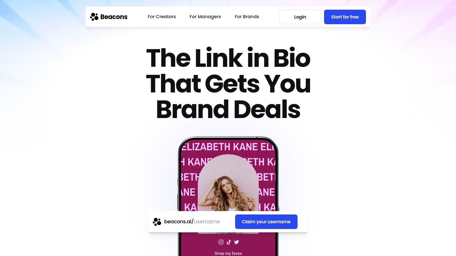
Beacons sits in a different category from classic link hubs. It's closer to an all-in-one creator business tool. That makes it attractive for TikTok creators who don't just want clicks. They want a store, list growth, brand deals, and a central place to run the business side.
This is a strong fit for creators selling digital offers, memberships, or media kit access directly from social traffic. For affiliate-heavy creators, it also helps keep monetization functions under one roof rather than stitching together several tools.
Best fit for monetizing creators
Beacons is usually at its best when the bio itself is part storefront, part lead capture system. Coaches, educators, and creators with multiple monetization paths often like that.
Useful strengths include:
Direct monetization orientation: Better than a plain directory-style page.
Email and creator tools: Helpful for creators who want fewer separate platforms.
Broader business utility: Especially relevant for creators pitching brands and managing offers.
The trade-off is focus. When a tool tries to handle many creator-business tasks, the bio page can become crowded if the creator doesn't impose a clear hierarchy. TikTok punishes clutter faster than Instagram does.
What to watch before choosing it
Beacons can work very well, but it rewards active maintenance. A creator needs to keep old offers from sitting too high on the page and make sure the current campaign owns the first screen.
That's the recurring TikTok problem. Many creators lose conversions because every CTA is treated as if it deserves equal space.
Beacons is a strong option for creators who monetize directly from their bio and want more than a simple link page. It's less ideal for someone who wants a cleaner, campaign-first layout with less temptation to overbuild.
4. Lnk.Bio
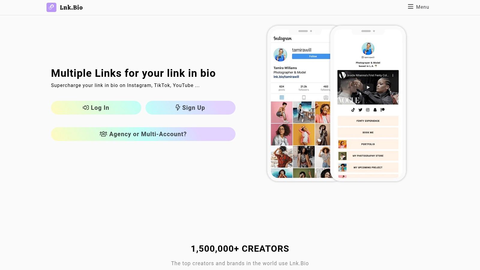
Lnk.Bio appeals to a specific kind of creator. Someone who wants speed, simplicity, and low ongoing cost. It has a minimal feel and doesn't ask for much setup effort, which makes it useful when the goal is to get a bio page live fast.
That simplicity can be a strength on TikTok. Less visual clutter often helps. The risk is that minimal tools can also make the page feel generic if the creator wants stronger branding or campaign framing.
Best for lean setups
Lnk.Bio works well for creators who mostly need a fast outbound hub and don't want to manage an elaborate page design. It's also attractive for people who like straightforward pricing and don't want another large monthly software bill hanging around.
Good fits include:
Affiliate creators with a few active offers
Small businesses that want a durable, low-maintenance page
Musicians or creators promoting a current release plus a few evergreen links
One nice advantage is broad embed support and a setup flow that doesn't get in the way.
Where the limits show up
TikTok traffic often needs stronger emphasis than a simple minimal page can provide. When a creator wants featured campaigns, richer cards, stronger visual contrast, or better campaign control, Lnk.Bio can start to feel plain.
That doesn't make it bad. It just means Lnk.Bio is best when the strategy is intentionally simple, not when the bio page behaves like a conversion-focused mini landing page.
5. Campsite.bio
Campsite.bio is one of the cleaner middle-ground tools. It offers more structure and team utility than the barebones options, but it doesn't feel as heavy as all-in-one creator business platforms. That balance makes it a good fit for creators, startups, and agencies that want organized pages and collaborative control.
For TikTok, that matters most when several people touch campaigns. A creator manager, brand marketer, or assistant may need to swap featured offers quickly after a post starts trending. Campsite.bio handles that operational side better than many lightweight tools.
Why teams like it
The page builder is approachable, and multi-profile management is useful for small teams or agency setups. Highlight blocks, carousels, forms, scheduling, and pixel support make it practical without making every page feel overloaded.
Strong use cases include:
Managing multiple campaigns: Good for brands with ongoing promos and rotating launches.
Shared ownership: Useful when updates don't come from a single person.
Email capture support: Helpful for list building without building a full website first.
What works: Put the current campaign first, then one trust-building secondary block, then the archive. Most creators reverse that order and pay for it.
Best and worst fit
Campsite.bio is a good operational choice. It's less exciting from a design standpoint than more flexible card-based tools, but that can also be a positive if the priority is getting pages updated quickly without too much tinkering.
Campsite.bio makes sense for small teams, agencies, and creators who want more control than a basic link list but don't want to fully move into a commerce-first platform.
6. Squarespace Bio Sites
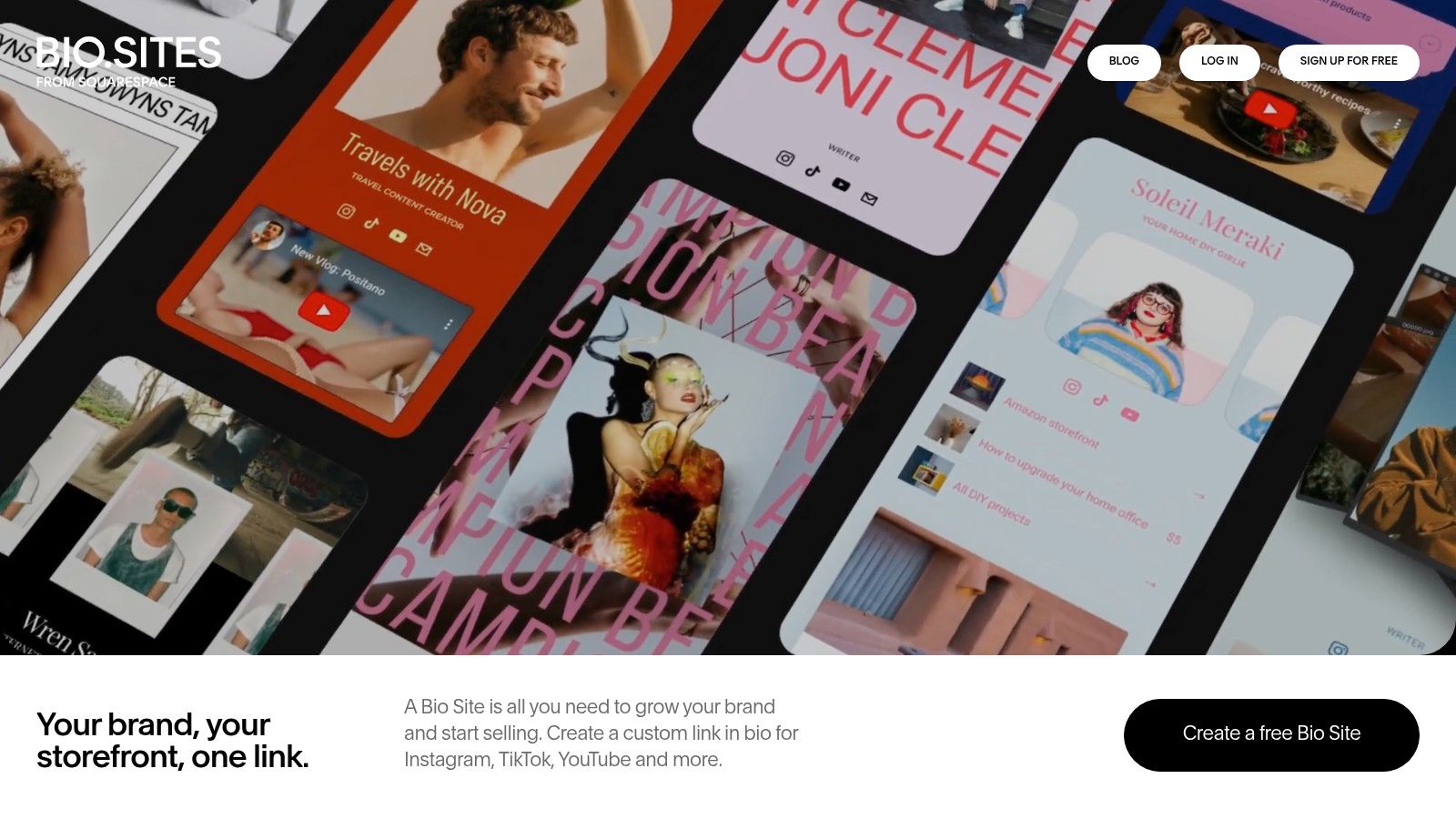
Squarespace Bio Sites, through Bio Sites and Unfold, is a good choice for creators who care a lot about polish. Some link-in-bio tools feel functional first and attractive second. This one leans the other way.
That's valuable for brand-conscious creators, musicians, photographers, coaches, and startups that want the bio page to feel aligned with the rest of their visual identity. TikTok users still move fast, but a strong presentation can help when the offer needs a little more context than a plain button list can provide.
Where it shines
Squarespace Bio Sites is especially good for:
Design-forward personal brands
Creators already using Squarespace products
Simple lead capture and content promotion
Aesthetic-first pages that still need mobile usability
The publishing workflow is easy from the web or mobile, and the templates look more refined than many cheap-looking alternatives.
The trade-off
The main issue is that a polished design doesn't automatically equal a better TikTok conversion flow. If the creator gets too precious about aesthetics, the CTA can get softened. On TikTok, the page still needs one obvious next action.
Squarespace Bio Sites works best for creators who want a nice-looking bridge between social and website, and who are willing to keep conversion clarity ahead of visual decoration.
7. Flowpage
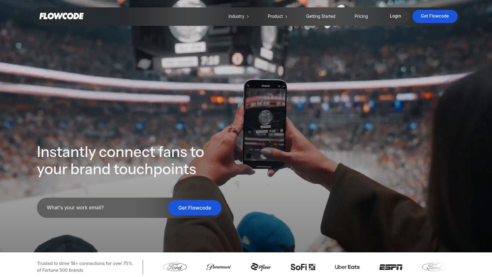
Flowpage is a different kind of recommendation because it becomes much more compelling when TikTok is only one part of the traffic mix. Brands running events, retail displays, packaging, print promos, or venue campaigns often need the bio link and the QR strategy to work together. That's where Flowpage stands out.
For a solo creator just trying to route TikTok views to one offer, it may be too much. For a business connecting offline and online campaigns, it can be extremely useful.
Best for brands, events, and QR-heavy campaigns
Flowpage fits teams that care about attribution beyond social. A campaign might start with a TikTok post, continue through a QR scan at an event, and land on the same mobile destination. That's a very different use case from a creator-only setup.
Good scenarios include:
Retail and packaging campaigns
Event activations
Venue promotions
Multi-channel brand launches
Its analytics and enterprise orientation are stronger than those of many creator tools.
Why some creators should skip it
Most solo creators don't need that complexity. They need speed, hierarchy, and quick campaign updates. Flowpage can support those, but it isn't the most obvious fit if TikTok bio conversion is the only goal.
Flowpage is best reserved for brands and teams that care about QR-to-landing-page measurement as much as the social bio link itself.
8. Later Link in Bio
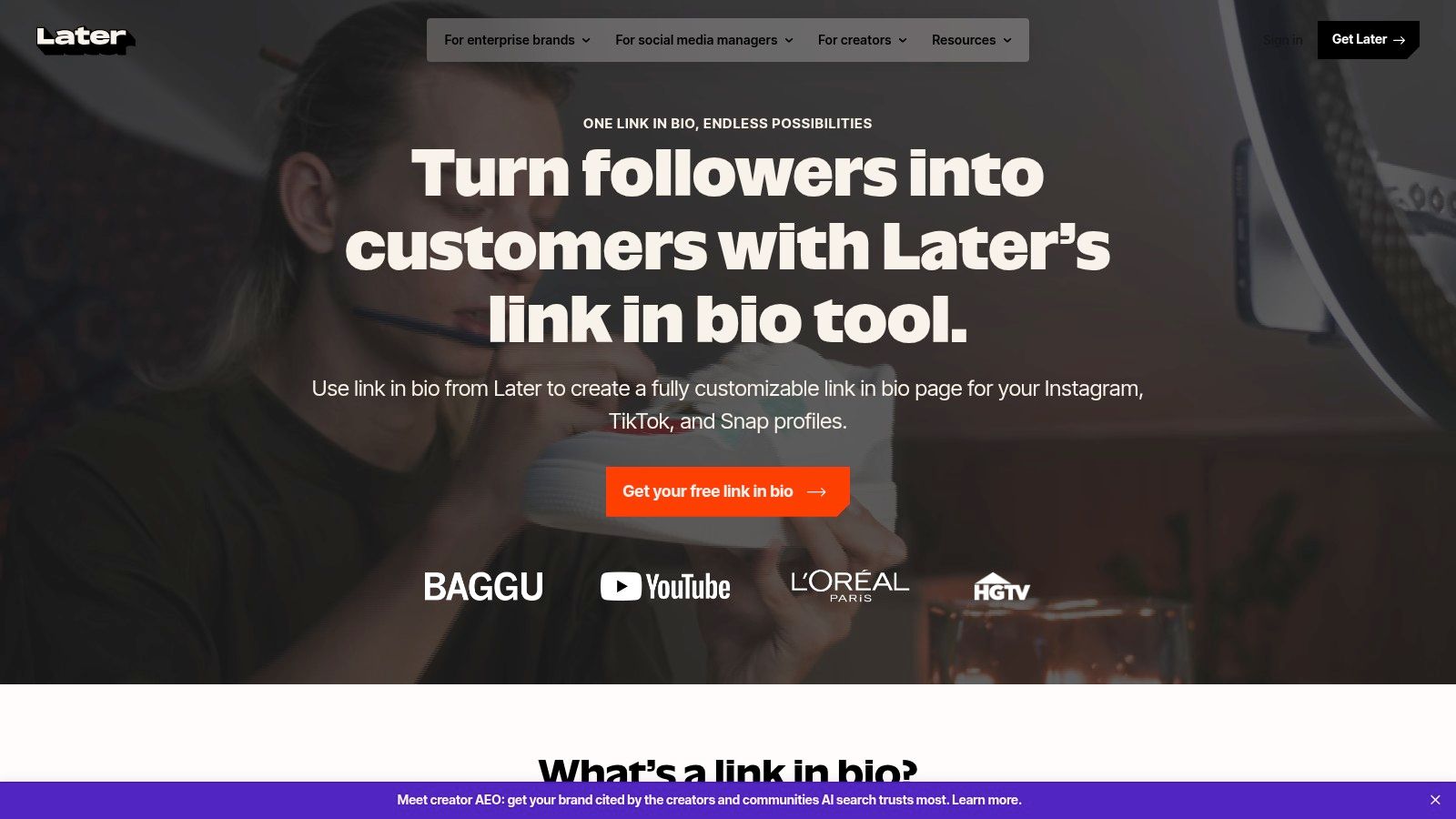
Later Link in Bio makes sense for one specific buyer. The creator or social team already schedules inside Later and wants the bio page tied closely to that publishing workflow.
That matters more on TikTok than on slower traffic sources. A video spikes, people tap fast, and the click loses value if the landing page still features yesterday's campaign.
Strong for teams that publish constantly
Later works best when the speed of updating matters more than page customization. If a team is posting across TikTok, Instagram, and YouTube, keeping the bio destination aligned with current content is often a key conversion win.
The appeal is operational:
Faster updates after a post goes live
A tighter connection between the content calendar and the bio CTA
Useful media blocks for cross-platform promotion
Less manual work across separate tools
I've seen this trade-off play out a lot. A simpler page that stays current usually converts better than a prettier page that goes stale for three days.
Where it fits, and where it doesn't
Later is a practical choice for agencies, brand teams, and creators already paying for scheduling. It removes one more handoff, and handoffs are where TikTok clicks get wasted.
It is less convincing for creators who treat the bio link like a storefront or a custom mini-site. If the priority is heavier design control, stronger selling flows, or more personality on the page, other tools fit better.
Later Link in Bio is an efficiency pick. For teams that care about matching fast-moving content with an equally current destination, that can be enough to beat tools with longer feature lists.
9. Stan Store
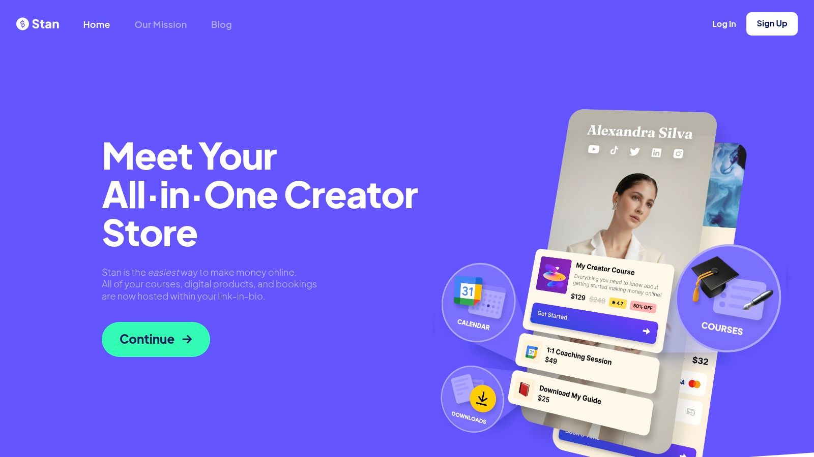
Stan Store is built for direct monetization. That makes it one of the most obvious fits for TikTok creators selling digital products, coaching, calls, memberships, or simple offers that need a short path from interest to checkout.
For many creators, this is the answer when “best link in bio for TikTok” really means “best way to sell from TikTok.” Stan is less about browsing and more about conversion.
Best for coaches, experts, and digital sellers
Stan Store is strong when the main job is one of these:
Selling a digital product from a viral explainer video
Booking coaching or consulting
Pushing a simple lead magnet into a follow-up funnel
Running a compact storefront instead of a generic bio page
The setup is usually straightforward, and the commerce-first experience is useful for creators who don't want to duct-tape checkout onto a separate bio tool.
Where it can be limiting
The trade-off is flexibility. If the creator wants a more editorial or media-rich bio page with richer embeds and a more custom visual hierarchy, Stan can feel narrower than card-based layout tools.
That isn't a flaw for its target user. It's the whole point. Stan Store is best for creators who want the bio link to behave like a storefront first and a profile hub second.
10. Milkshake
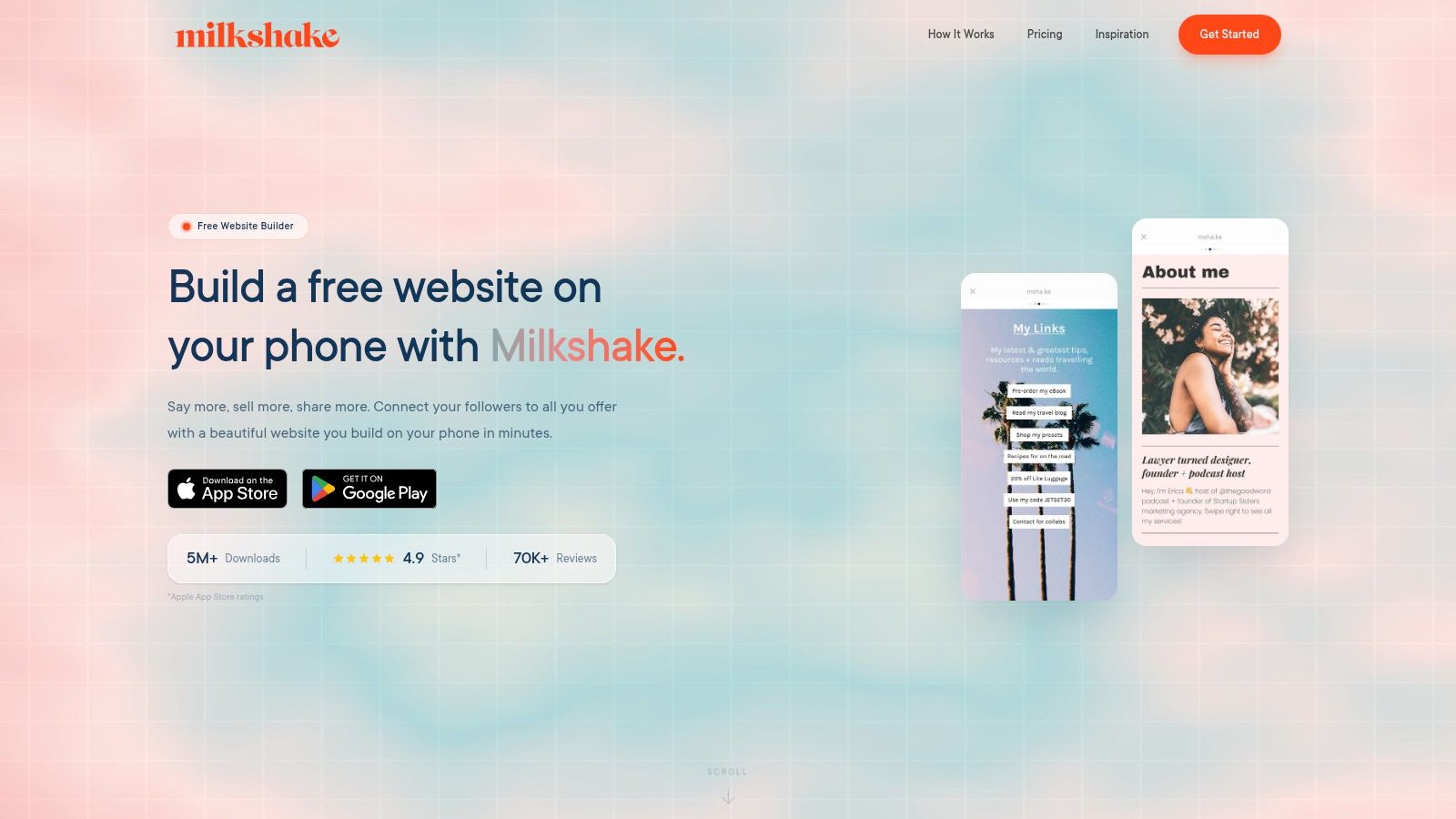
Milkshake is mobile-first in the most literal way. It feels like a mini site builder for people who want to work quickly from a phone and publish something visual without opening a laptop. That's appealing for solo creators, local businesses, and personal brands that operate mostly on mobile.
The card-style approach can also work well for simple TikTok funnels because it avoids the lifeless “stack of buttons” feel.
Good for creators who update on the go
Milkshake suits:
Creators publishing and editing from mobile
Service businesses needing a quick branded page
Simple campaign pages with a light design personality
Low-cost setups for early-stage creators
Its template variety helps creators get something decent-looking up and running fast.
Where it falls short
The more strategic the campaign gets, the more Milkshake can feel lightweight. Advanced analytics, deeper tracking, and stronger control over page hierarchy sit behind higher tiers or outside the platform's core simplicity.
Milkshake is a good starter option for mobile-first creators, but most growth-focused TikTok sellers will eventually want sharper analytics and more deliberate control over CTAs.
Top 10 TikTok Link-in-Bio Platforms Comparison
Feature count is a weak way to pick a TikTok bio link tool. TikTok clicks come in hot, with one clear intent, and they drop fast if the page loads slowly or forces the visitor to sort through 10 equal-priority options. The better comparison is simple: which tool helps you put the right CTA in front of that traffic, update it quickly, and see which people tapped it.
Product | What it does well | Conversion and analytics trade-off | Best fit | Price and plans | Standout angle |
|---|---|---|---|---|---|
Linkie | Visual builder with draggable and resizable cards, email capture, sticky banners, dynamic links, custom domains, unbranded pages | Real-time and historical metrics, per-card engagement, source, bounce, clicks, subscriber growth | Creators, DTC brands, agencies, multi-brand creators, freelancers | Free tier, Plus for advanced analytics, email capture, custom domains, dynamic links, Multi for 5 Linkies | Strong layout control without forcing a generic button stack. Useful if TikTok traffic needs a clear featured CTA and fast page swaps |
Linktree | Unlimited links, embeds, commerce tools, QR and shortener, UTM support | Good coverage across link, device, location, and referrer data. Better on paid plans | Solo creators and small brands that want a mature app ecosystem | Free basic plan, paid tiers add commerce and more advanced tools, Premium removes seller fees | Broad integrations and familiar setup. Easy to launch, but pages can start to feel crowded if you do not control the hierarchy |
Beacons | Link in bio, storefront, memberships, email marketing, media kit | Sales and engagement tracking are useful for creators selling directly. Fee structure matters if volume grows | Creators selling products, offers, and brand deal inventory from one place | Free with seller fees, paid tiers reduce fees and add custom domains and automation | Good all-in-one choice if the bio page is also your checkout and creator business hub |
Lnk.Bio | Minimal pages, unlimited links, scheduling, password and gated links, broad embeds | Pixels and stronger analytics sit on paid tiers. Core pages stay simple and quick | Users who care about low ongoing cost and no-fuss setup | Free plan, optional lifetime payment tiers, paid add-ons for domains and analytics | Low-cost option that stays focused. Good for creators who want a clean page more than a mini website |
Campsite.bio | Unlimited links, highlight and carousel blocks, scheduling, opt-ins, pixel support, multi-profile tools | Higher tiers add more detailed analytics and team-level visibility | Individuals, small teams, and agencies that need collaboration controls | Affordable Pro plan, Pro+, and Org Pro+ add analytics and organization features | Better fit for teams than many creator-first tools. Useful if several people need to update campaigns |
Squarespace Bio Sites (Unfold) | Design-heavy templates, links, embeds, forms, web, and mobile publishing | Basic on-page analytics. Stronger data usually comes from the wider Squarespace setup | Creators who care about presentation and may later want a full website | Free to start, advanced website features require a separate Squarespace subscription | Best for brand presentation. Less appealing if you mainly need rapid CTA swaps tied to TikTok posts |
Flowpage (Flowcode) | Dynamic QR codes, mobile Flowpages, short URLs, templates | Strong attribution for QR-driven traffic, plus geodata and enterprise reporting | Events, venues, and brands running offline to online campaigns | Core features are paid, higher tiers add analytics, CRM, API, and compliance | Strong choice when TikTok is the only traffic source, and QR attribution matters just as much |
Later, Link in Bio | Customizable bio page, featured media blocks synced to posts, mobile and web publishing | Basic page metrics. More useful if you already use Later for scheduling and reporting | Teams already managing content in Later | Included with Later, deeper insights depend on Later's paid plans | Convenient for operations. The main value is keeping posted content and bio destinations in sync |
Stan Store | Digital product sales, bookings, memberships, coupons, upsells, funnels, pixel, and email capture | Commerce-first reporting is better than generic link tools if your goal is to sell | Creators focused on direct monetization and simple funnels | No free plan, two-plan structure, Pro adds funnels and upsells | Better store than link hub. Strong fit if the TikTok click should lead straight to an offer |
Milkshake | Mobile-first card pages with templates, contact form, mailing list integrations, and QR sharing | Meta Pixel and GA are available on higher tiers. Free-tier insight is limited | Mobile-first creators and solo businesses that publish quickly | Low entry price, Pro+ adds custom domains and analytics | Fast to build from a phone. Better for simple pages than heavier conversion setups |
A few patterns show up fast.
Creators pushing one active offer usually do better with tools that let them feature a single dominant CTA, change it in minutes, and track card-level behavior. That is why tools like Linkie, Stan Store, and Beacons tend to outperform generic multi-link setups for active TikTok campaigns. The page has to match the video people just watched.
Teams and agencies face different problems. They need permissions, multi-profile management, and cleaner update workflows, which makes Campsite.bio, Later, and Linkie are more practical than lightweight solo-creator tools. Linktree still works, but it is easiest to overbuild there and lose page clarity.
Budget matters, but cost only matters in context. Lnk.Bio is attractive because the ongoing spend stays low. Stan Store can justify a higher monthly cost if one extra sale covers it. Squarespace Bio Sites can make sense if the bio page is part of a broader brand site plan, not just a quick TikTok conversion layer.
The trade-off is speed versus depth. Some tools are fast to launch but thin on insight. Others offer stronger tracking and monetization options but require tighter setup discipline to keep the page focused. For TikTok, being focused usually wins.
What Actually Matters in a TikTok Bio Link
TikTok bio clicks are impatient. They do not browse like search visitors or email subscribers. They come from one video, with one expectation, and they make a decision in seconds. If the page feels off, slow, or crowded, that click is wasted.
TikTok also gives you very little room to recover. Business accounts can add a website through Edit profile, while the bio itself stays short, as explained in this Sprout Social TikTok bio link guide. That puts real pressure on the link page to do the selling.
The mistake is treating a bio link like a storage unit. On TikTok, it needs to work like a fast mobile landing page.
What tends to separate pages that convert from pages that just collect taps is simple:
One obvious first action: The top CTA should match the video, product, or offer driving traffic right now.
Tight choice count: A main CTA plus one or two secondary paths usually works better than a long list of links of equal priority.
Fast edits: TikTok spikes happen quickly. If a post starts sending traffic tonight, the page should be updated tonight.
Mobile clarity: Big tap targets, readable spacing, and clear hierarchy matter more than visual extras.
Useful click insight: Total clicks are not enough. It helps to see which buttons get tapped and which paths lead to signups, checkouts, or deeper visits.
I have seen creators lose good traffic with pages that looked polished but asked visitors to do too much. Expired promos, old affiliate links, multiple "start here" buttons, and buried offers create hesitation. TikTok users rarely slow down to compare options. They tap the clearest next step or leave.
The right setup depends on what you sell. Product brands usually need one featured item or collection above the fold. Affiliate creators usually convert better when the top recommendation aligns with the video's exact promise. Coaches, consultants, and digital product sellers need a first screen that answers one question quickly: what happens after the tap?
Design still matters. Page hierarchy matters more.
That is why simpler, flexible builders often beat bigger link stacks for TikTok traffic. Featured cards, quick CTA swaps, and a layout that keeps the current offer first tend to perform better than pages built to hold everything at once. As noted earlier, Linkie fits that use case well for creators who need fast updates, a cleaner CTA structure, and a page that works more like a conversion layer than a link archive.