Most TikTok bio advice is bad because it treats the bio like a tiny About page. That misses the point.
A real TikTok bio strategy treats the bio as a conversion checkpoint between attention and action. Viral reach doesn't pay bills on its own. Followers don't either. What matters is whether profile visitors understand the offer, trust it fast, and click.
TikTok traffic behaves differently from Instagram traffic. People often arrive from a single video, with loose context and lower intent. They scroll, tap, and leave fast. That means the profile has to do one job well. It has to turn curiosity into the next step.
Why Your TikTok Bio Is Your Most Important Conversion Tool
A lot of brands still obsess over views first and conversion second. That's backward.
TikTok gives profiles one link. That alone makes the bio high stakes. Mojo's TikTok bio guidance points out that the platform allows only one profile link, which is why the bio has to summarize the account, answer “Why watch?”, include a CTA, and communicate a USP in very little space. That matters even more because 72% of Gen Z have a TikTok account, according to Sprout Social coverage cited in Mojo's bio fundamentals.

That creates a simple reality. The bio is often the first serious decision point after someone enjoys a video.
TikTok attention is fast and low intent
Instagram profile visitors usually know more about the account before they click. TikTok visitors often don't. They may have seen one clip, one opinion, one product demo, or one joke. They're interested, but not committed.
So the bio can't behave like a brand mission statement. It has to behave like a headline.
A TikTok bio should answer one question immediately. “Why should this person click right now?”
For teams trying to move traffic into leads or sales, driving traffic from TikTok starts with that mindset shift. The profile isn't a passive brand asset. It's a filtering and routing layer.
Views don't convert by default
A video can pull a lot of attention and still produce weak business results if the profile creates friction.
Common failure pattern:
The video is specific. It talks about one product, guide, lesson, or transformation.
The bio is generic. It says “creator,” “founder,” or “daily content.”
The link destination is broad. It dumps visitors into a cluttered page with too many options.
That sequence kills momentum. TikTok rewards immediacy, and the bio has to preserve it.
The strongest profiles make a promise that aligns with the content that brought the visitor there. That's why the bio matters more than often realized. It's not decoration. It's the shortest path from scroll to subscriber, lead, or sale.
The 3-Step Framework for a High-Converting Bio
Most profiles fail because they try to do branding, storytelling, networking, and selling in one tiny box. A better approach is narrower and more disciplined.

Clarify the outcome
The first line of a strong bio isn't about identity. It's about value.
Weak bios describe the account:
UGC creator
Skincare brand
Marketing coach
Daily videos
Better bios tell visitors what they get:
Free UGC pitch templates ↓
Shop barrier-support skincare ↓
Book a content strategy audit ↓
Get weekly creator deals ↓
That shift matters because people don't click descriptions. They click outcomes.
A creator selling education should name the resource. A local business should name the action. A product brand should name the offer or category, not just the company type.
Create one primary CTA
Most TikTok bios ask visitors to do too much. Shop the store. Join the newsletter. Listen to the podcast. Book a call. Watch YouTube. Download the freebie.
That usually weakens everything.
A profile needs one primary conversion goal tied to the current business priority. Secondary options can appear on the destination page, but the bio itself should focus on one main action.
A simple way to choose the primary CTA:
Business type | Strong primary CTA |
|---|---|
Creator | Download templates |
Coach or consultant | Book a call |
E-commerce brand | Shop best-sellers |
Musician | Pre-save the release |
Local business | Book an appointment |
Affiliate publisher | Get the product picks |
Match the bio to the current content
The highest-converting bios aren't static. They change with the campaign.
If recent videos focus on a lead magnet, the bio should point to it. If the account is posting about a launch, the bio should reflect the launch. If a service provider is pushing discovery calls, the profile should stop promoting unrelated links.
Practical rule: Recent videos, profile bio, link page, and landing page should feel like one continuous conversation.
A lot of brands lose conversions by posting a strong product demo, then sending visitors to a page built for an older offer. That disconnect breaks trust.
A tighter alignment looks like this:
Video topic says what the viewer will learn or get.
Bio line repeats the same promise in compressed form.
Link destination opens to the same offer, not a random list.
That framework sounds basic. It isn't. Most profiles still ignore it, which is why so much TikTok attention dies at the profile level.
How to Write Bio Copy That Actually Gets Clicked
Good TikTok bio copy is blunt. It doesn't try to sound clever. It tells the right person what they'll get and what to do next.
That's why benefit-driven copy keeps beating descriptive copy.

Weak vs strong bio lines
Here are examples that reflect the profiles that usually underperform versus the ones that create action.
Type | Weak bio | Strong bio |
|---|---|---|
Creator | Content Creator | Daily Videos |
E-commerce | E-commerce Brand | Shop our best-selling products ↓ |
Coach | Helping people succeed | Book a clarity call ↓ |
Affiliate | Reviews and recommendations | Get this week's top product picks ↓ |
Musician | Singer-songwriter | Pre-save the new single ↓ |
Local business | Family-owned salon | Book your next color appointment ↓ |
The stronger version does three things fast:
Names the benefit
Signals relevance
Tells people what action to take
Strong CTAs beat vague CTAs
InfluenceFlow outlines a practical testing approach for TikTok bios and reports that changing a vague CTA like “learn more” to an action-oriented CTA like “shop now” can lift link clicks by 15% to 20%, while passive language can reduce conversions by over 30%. It also notes that bios with a clear USP and a specific offer can drive a 2.5x higher subscriber acquisition rate, based on its documented bio-optimization framework outlined in its TikTok bio guide.
That lines up with what usually happens in practice. Specificity wins. Passive wording loses.
Good CTA examples:
Shop best-sellers
Get the free guide
Book the consult
Download the checklist
Join the newsletter
Pre-save the release
Bad CTA examples:
Learn more
Check it out
Click below
Explore
Welcome
More info
The best bio format is compact
A simple structure works well for most profiles:
Value line with a clear benefit
USP or qualifier if needed
CTA pointing to one destination
Examples:
Free creator growth templates ↓
Science-backed skincare for sensitive skin ↓
Weekly restaurant marketing tips + free audit ↓
The job of the bio isn't to tell the full story. The job is to earn the click.
Don't ignore profile signals
Bio copy doesn't work alone. The profile image, username, and recent videos affect how credible the bio feels.
A few practical rules:
Use a recognizable profile photo. Faces tend to work well for personal brands. Clean product or logo treatments work for stores.
Keep the username brand-consistent. Don't make people decode who the account belongs to.
Make recent posts support the promise. If the bio says “free templates,” recent videos should reinforce that promise.
For teams that also manage Instagram, getting more clicks from an Instagram bio uses similar copy principles, but TikTok profiles need even more compression and urgency because the traffic is less patient and often colder.
Designing a Link-in-Bio Page for TikTok's Audience
A sharp bio won't save a weak destination. If the page after the click is slow, cluttered, or mismatched, TikTok traffic disappears.
That's why link-in-bio design matters just as much as bio copy.
What TikTok visitors need after the click
TikTok visitors usually don't want a menu. They want confirmation that they landed in the right place.
The destination page should immediately answer:
What is this?
Why should this matter right now?
What should be tapped first?
That means the top of the page should match the topic or offer that drove the visit. If the video promoted a product drop, show the product first. If the video promised a checklist, show the signup first. If the video was local and service-based, show booking first.
A generic stack of buttons that look identical often fails because it forces the visitor to do the sorting.
What to look for in a link-in-bio tool
When evaluating tools, the criteria should be practical rather than cosmetic.
Criterion | What matters for TikTok traffic |
|---|---|
Mobile experience | The page should feel native on a phone |
Page speed | Delays kill curiosity |
Analytics | Clicks alone aren't enough |
Custom domains | Better brand continuity |
Layout flexibility | The primary offer should dominate visually |
Conversion design | Forms, product cards, and embeds should reduce extra taps |
A simple button list can work for low-stakes traffic. It usually isn't enough for serious conversion work.
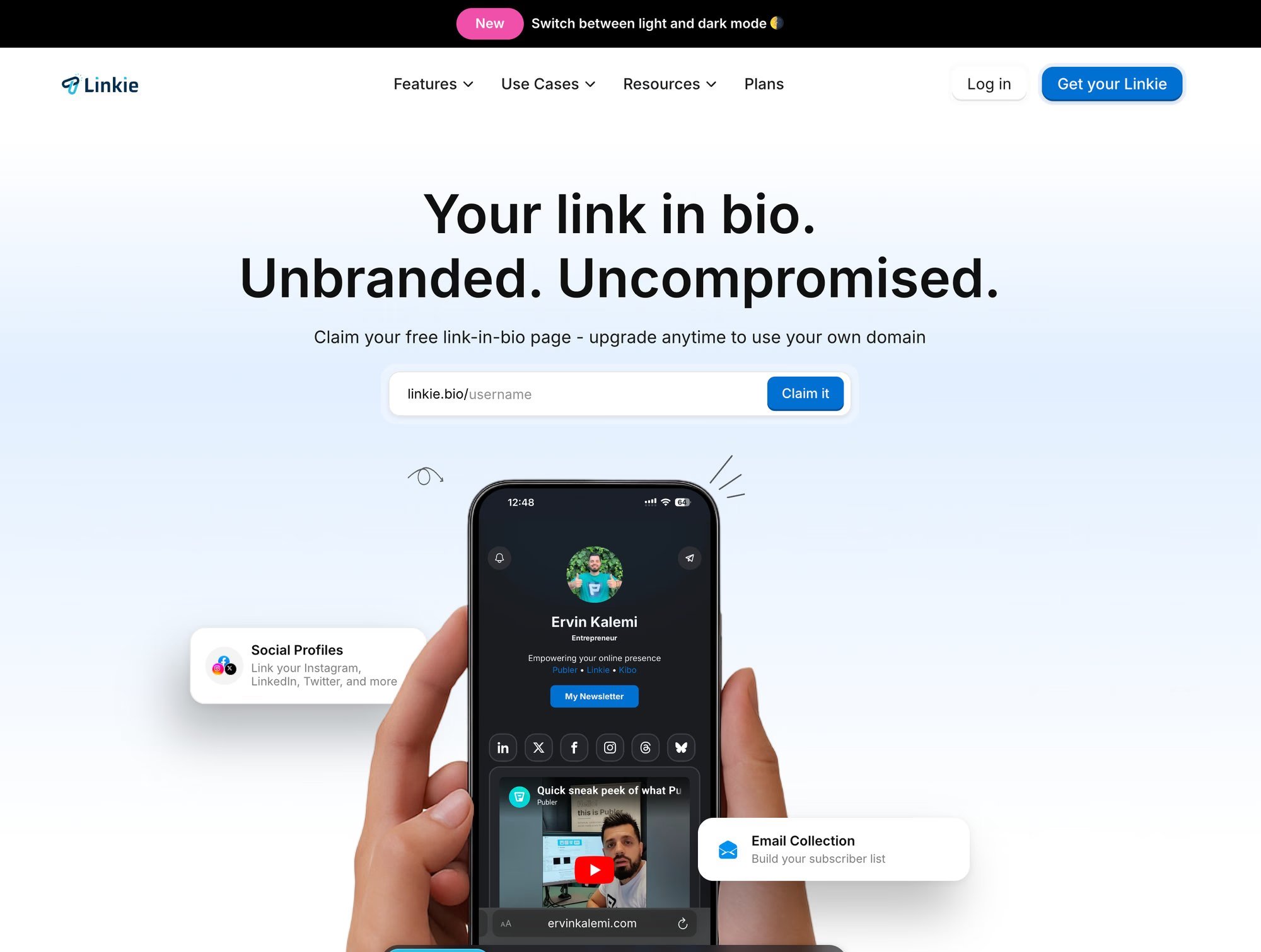
Some teams use no-code page builders. Others use dedicated link-in-bio tools. One option is Linkie, which supports drag-and-drop cards, multiple content types, custom domains on paid plans, and analytics such as traffic sources, bounce rate, clicks, and card-level engagement. That kind of setup is useful when a profile needs to feature one primary offer without burying secondary links.
For teams comparing setups, creating a high-converting link-in-bio comes down to message match and hierarchy, not just design.
Page layouts that fit common TikTok goals
For creators
Put the lead magnet or newsletter signup first
Add one secondary card for paid products or sponsorship info
Keep social links lower on the page
For e-commerce brands
Feature the best-selling product or collection first
Add a second card for a current promotion or bundle
Keep general store navigation below priority cards
A quick walkthrough helps show the difference:
For local businesses
Place booking, call, or directions at the top
Add a proof element, such as services, menu, or featured work
Remove anything that distracts from the appointment action
Reduce choices at the top. Expand choices lower down.
One page, one dominant action
The best TikTok destination pages don't hide everything except one offer. They make one offer visually and strategically dominant.
That distinction matters. A page can still support product cards, a newsletter, affiliate links, and social proof. It just shouldn't ask visitors to evaluate all of them at once.
For TikTok traffic, hierarchy beats completeness almost every time.
Your Bio as a Testing System, Not a Static Headline
Most TikTok bio advice stops after the writing. That's where the actual work starts.
A useful TikTok bio strategy treats the profile like a measurable system. Copy changes should connect to performance changes. If they don't, the bio is still guesswork.

Track the full funnel
Sprout Social notes that TikTok profile analytics can be accessed through Business Suite or Creator Tools, and strategy guidance recommends testing a new bio for 2 to 4 weeks against baseline metrics such as profile views and link clicks. That urgency matters because 60% of users interact with short-form videos shorter than 60 seconds, which means the profile has to convert fast-moving traffic quickly, as outlined in Sprout Social's TikTok stats roundup.
The right metrics aren't limited to click counts.
Useful signals include:
Profile views
Bio link click-through behavior
Traffic source data
Bounce rate on the destination page
Card-level engagement
Email signups
Purchases or lead submissions
Diagnose the actual bottleneck
Different patterns point to different problems.
What happens | Likely issue |
|---|---|
Profile views rise, clicks stay flat | Copy is weak or unclear |
Clicks rise, conversions stay weak | The destination page isn't relevant enough |
Specific cards get ignored | Visual hierarchy is off |
Traffic lands but exits fast | The page creates friction or a mismatch |
Many teams misread performance, assuming the bio failed when the page failed, or blaming the page when the offer itself isn't strong enough.
Diagnostic rule: If people visit the profile but don't click, rewrite the promise. If they click but don't convert, rebuild the destination.
A practical testing cycle
A simple testing process works better than occasional random edits.
Week one
Test CTA specificity. Replace soft language with direct action language tied to the offer.
Week two
Test the offer framing. A “free guide” may pull different behavior than a “video” or “templates” offer, even if the core value overlaps.
Week three
Test presentation details. Emoji use, line order, and the placement of the primary promise can make the bio feel scannable or noisy.
This testing mindset matters because mainstream advice already tells people to rotate CTAs and update bios regularly, but very little of that guidance explains how to connect changes to outcomes. JoinBrands clearly points out the gap in its discussion of rotating CTAs and regular updates in its TikTok bio ideas article.
What to change first
When results are weak, the smartest order is:
Fix the offer
Tighten the CTA
Improve message match between video and page
Simplify the destination layout
Test supporting details
That's the difference between a static bio and a conversion system. One is written once and forgotten. The other keeps earning more from the same attention.
Your 5-Minute TikTok Bio Audit Checklist
A profile doesn't need a full rebrand to improve. It needs a sharper promise, cleaner hierarchy, and better measurement.
Use this checklist as a fast pass/fail audit.
Bio clarity check
Does the bio state a clear outcome? Visitors should know what they'll get, not just who the account is.
Does the first line make sense to a new visitor? Assume they only saw one video and know almost nothing else.
Is there a visible USP? The profile should hint at what makes the offer distinct.
Does the CTA use direct action language? “Shop,” “book,” “download,” and “join” are stronger than vague filler.
Conversion focus check
Is there one primary conversion goal? If the bio promotes everything, it won't move anything well.
Does the current bio match recent content themes? The profile should reinforce the thing the account is talking about now.
Would a visitor understand the next step immediately? If they have to think too much, they'll leave.
Link destination check
Does the page feel built for mobile? TikTok traffic is mobile-first, so the destination should be easy to scan and tap.
Is the top card or top link directly related to current videos? Relevance should be obvious at first glance.
Is the primary offer visually dominant? It shouldn't compete on equal terms with every other option.
Are secondary links pushed lower? They can exist without distracting from the main action.
Measurement check
Is there a baseline before changing the bio? Without a starting point, it's hard to judge improvements.
Are profile views and link clicks being tracked? Those are the first signals to watch.
Is post-click behavior being reviewed? If clicks happen but signups or purchases don't, the destination likely needs work.
Is the bio reviewed regularly? The strongest profiles treat updates as part of campaign management, not a one-time task.
A TikTok bio doesn't need more personality. Most of the time, it needs more precision.
A practical next step is to build a test page and compare message match, layout, and click behavior with a live offer. Linkie gives creators, brands, and agencies a simple way to set up a bio destination with flexible cards, analytics, and room for one primary action without turning the page into a cluttered link list. A free playground is available at Linkie's builder.