The usual problem isn't traffic. It's what happens after the click.
A creator posts consistently on Instagram or TikTok, the profile gets visits, the bio link gets tapped, and then nothing meaningful happens. Sales stay flat. Email sign-ups barely move. Bookings don't increase. The page technically works, but it doesn't convert.
That's because most bio pages are still built like storage closets. Every link gets thrown in. Old offers sit next to new ones. A podcast episode from six months ago competes with a product launch happening today. On mobile, that creates friction fast.
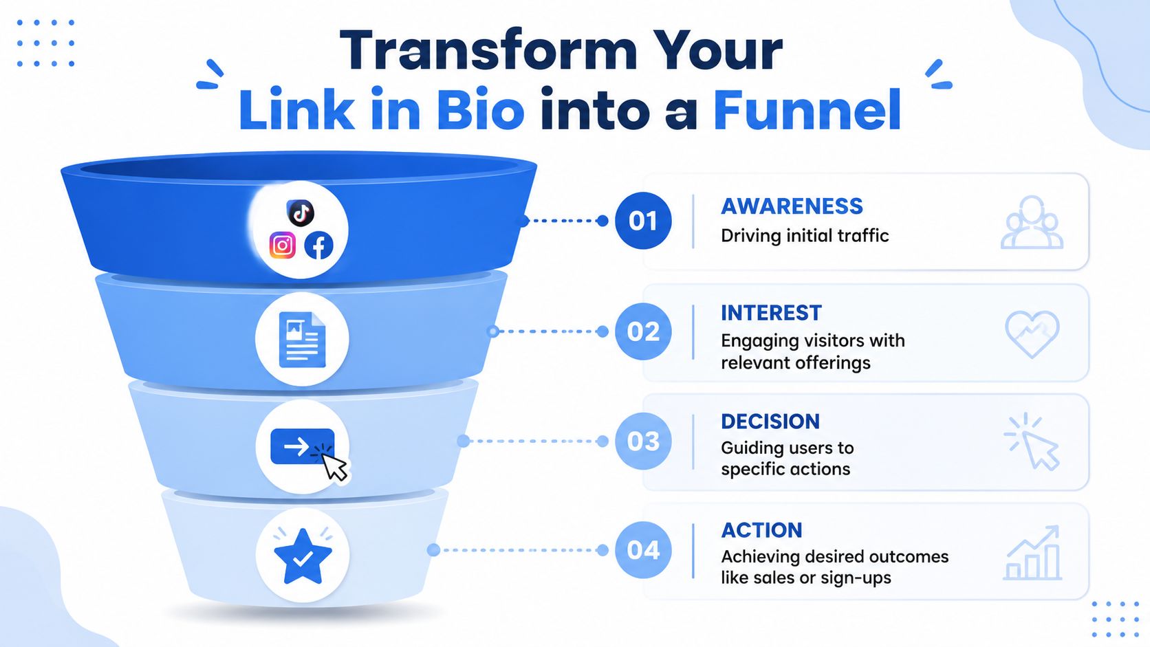
Creating a high converting link in bio begins with one hard truth. A bio page isn't a menu. It's a micro-landing page. Its job is to move a visitor toward one primary action with as little confusion as possible.
Stop Listing Links and Start Building Funnels
A high-converting bio page starts with restraint, not more options.
Most low-performing pages have the same flaw. They ask the visitor to decide too much, too quickly. A TikTok viewer who just watched a product demo has very different intent from an Instagram follower who wants updates, but both often land on the same generic stack of links. That mismatch kills momentum.
A better approach is to treat the page like a conversion funnel in miniature. The most useful guidance on this point is simple and practical. A strong page starts with a landing page mindset. Define one primary campaign goal, place the highest-value offer first, use action-oriented button copy, and keep the layout uncluttered to reduce decision fatigue, as outlined in this guide to creating a high-converting link in bio page.
Pick one outcome
The page needs a job. Not five jobs.
For most creators, brands, coaches, and small businesses, the primary goal usually falls into one of these buckets:
Sell a product by sending traffic straight to a featured item, bundle, or collection
Capture leads through an email opt-in, waitlist, or inquiry form
Book conversations for services, consulting, or client work
Drive content consumption when the business model depends on views, listens, or deeper audience nurture
If the page tries to do all four at once, it usually does none of them well.
Build around current intent
A TikTok post with “link in bio for the template” should not send people to a page where the template is buried under ten unrelated buttons. An Instagram Reel about a coaching framework should not route visitors into a broad homepage where they have to hunt for a booking link.
Practical rule: The first thing on the page should match the promise made in the post.
That's the funnel mindset. The social content creates intent. The bio page should continue that intent, not interrupt it.
What works and what doesn't
A simple comparison makes the difference obvious:
Approach | What happens |
|---|---|
Static link directory | Visitors scan, hesitate, and drop off |
Micro-landing page | Visitors understand the next step quickly |
Old links mixed with active offers | Campaign focus gets diluted |
One featured objective with supporting options | The page guides action instead of listing possibilities |
The strongest pages act like a curated storefront. They highlight one featured action, support it with a few secondary paths, and remove everything else.
That's the shift that matters most. Before adjusting colors, cards, or copy, the page needs a conversion path.
Design Your Page for Clicks and Conversions
Design isn't decoration on a bio page. It's navigation.
Visitors make a judgment before reading a single line. If the page looks generic, cluttered, or inconsistent with the creator's Instagram or TikTok presence, trust drops immediately. If it looks clear, branded, and visually organized, the next click feels easier.
That's why card-based layouts consistently outperform plain stacks of buttons in real-world use. Visual hierarchy matters. Linkfire reports that 25% of clicks on links in bio are driven by images, which is a strong argument for richer layouts instead of bare text lists, as noted in Linkfire's guidance on improving link in bio conversions.
Match the page to the platform journey
A good Instagram-to-bio experience should feel like one continuous brand interaction. Same tone. Same visual language. Same offer.
That doesn't mean every page needs heavy branding. It means the page should feel intentional. A musician can use cover art, release imagery, and a featured play button. A coach can use one strong headshot, a clean value proposition, and a booking card. An e-commerce brand can use product tiles, collection imagery, and a featured launch banner.
What usually fails:
Default template overload that looks like every other bio tool page
Random thumbnails pulled from inconsistent sources
No visual hierarchy, so every link has equal weight
Too much branding noise, where colors and graphics distract from the click target
Use cards to show value before the click
A plain button says very little. A visual card can do more work.
For example:
E-commerce brands can show the product image, not just “Shop now”
Creators selling digital products can preview the guide, template, or workshop
YouTubers can feature the newest video with a thumbnail that already earned attention on-platform
Musicians can embed a release teaser instead of sending every visitor to a generic streaming hub first
A card lets the visitor understand what they're clicking before they click it. That reduces uncertainty, especially on mobile.
A bio page should borrow the best parts of a landing page and the best parts of social content. Strong visuals, obvious hierarchy, and fast recognition.
Keep the mobile layout tight
Most bio traffic arrives from fast, distracted mobile sessions. Long pages lose people. Dense text blocks lose people faster.
A stronger structure looks like this:
Top section with clear identity and one featured action
Primary card or CTA tied to the current campaign
Two to four secondary options for other common intents
Optional social proof or embedded media only if it supports the main action
Tools matter here, but only because layout flexibility matters. Platforms such as Linkie use drag-and-drop cards, custom thumbnails, embeds, and flexible layouts, which makes it easier to build a page that feels like a compact landing page instead of a button archive.
The goal isn't to make the page prettier. It's to make the next click obvious.
Write Persuasive Copy and Powerful CTAs
Weak copy is one of the biggest conversion leaks on bio pages.
Design gets attention, but words close the gap between interest and action. A vague label like “Website,” “My Store,” or “Latest Project” forces the visitor to guess. Guessing creates hesitation. Hesitation lowers clicks.
The copy on a bio page should answer one question fast. What happens if this gets tapped?

Replace labels with outcomes
A high-performing CTA usually names the action and the benefit.
Compare these:
Weak CTA | Better CTA |
|---|---|
My Website | Shop the New Drop |
Newsletter | Get Weekly Creator Tips |
Book a Call | Apply for 1:1 Strategy Coaching |
Freebie | Download the Content Calendar Template |
YouTube | Watch the Full Tutorial |
The stronger versions are specific. They reduce ambiguity. They also better match how people arrive from Instagram Stories, TikTok captions, and pinned comments, where audience intent is often tied to one promise.
Follow the two-click rule
Every extra step between the bio page and the desired action creates drop-off. That's not theory. E-commerce usability research shows that requiring more than two clicks to reach a primary action like checkout can cause a 30% drop in conversion rates. The bio page should be the shortest path to conversion.
That means:
A product promo should go to the product or collection page, not the homepage
A lead magnet should go to the sign-up form, not a broad resources page
A service CTA should go to the booking or application page, not a generic about page
A workshop mention should go to the registration page, not a content hub
If a visitor has to click the bio page, then a homepage menu, then a product category, the funnel is already leaking.
Write CTAs that sound like momentum
The best CTA copy has motion in it. It sounds like the next step is already in progress.
Useful patterns include:
Get for downloadable value
Shop for immediate buying intent
Watch for video-led interest
Book or Apply for service businesses
Join for communities, waitlists, and memberships
A few practical examples from creator businesses:
Get the Notion template
Shop the summer collection
Book a brand audit
Join the waitlist
Watch the full review
What doesn't work nearly as well is soft, noncommittal language. “Learn more” has a place on websites. On a bio page, it often signals weak intent.
Audit every link against three questions
Before publishing, every link should pass this quick filter:
Is it tied to a current campaign
Is it the shortest path to the desired action
Is it relevant to the audience coming from this profile
If the answer is no, it probably doesn't belong on the page.
That's where persuasive copy becomes strategic copy. It isn't just about sounding better. It's about making the page easier to act on.
Use Analytics to Measure and Optimize Performance
A bio page shouldn't stay the same for months.
The strongest pages are tuned over time. Not constantly redesigned. Tuned. The difference matters. Random changes create noise. Measured changes produce cleaner decisions.
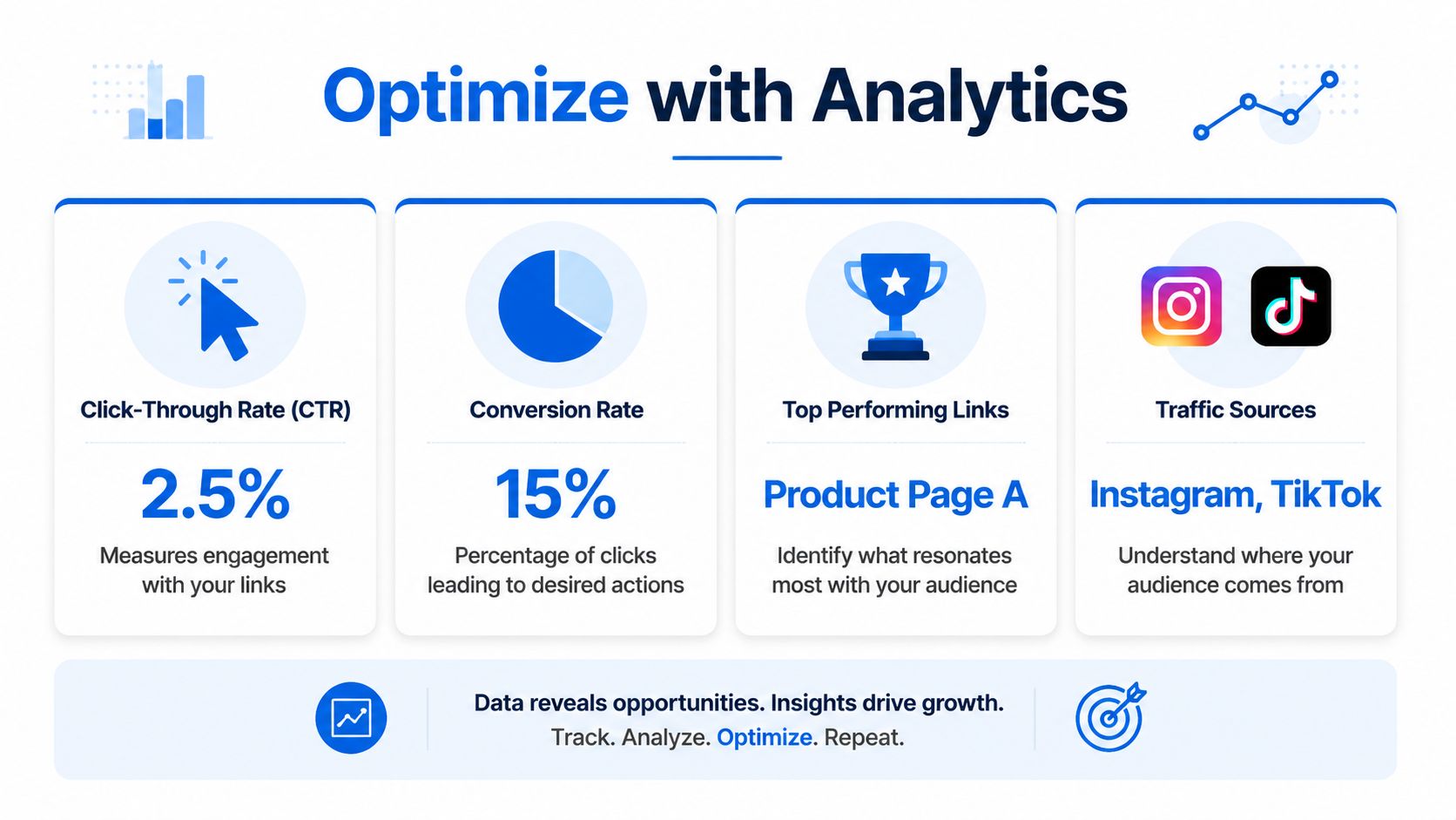
The most useful benchmark comes from creator analytics guidance. Average bio link click-through rates in 2026 hover around 2-4%, while top-performing accounts reach 8-10%. The same source notes that using analytics to test and optimize can increase engagement by up to 25%, according to Direct.me's beginner guide to link in bio analytics.
A quick visual makes the core metrics easier to keep in view.
Track the metrics that change decisions
Three metrics matter most for ongoing improvement:
CTR tells whether the profile and page are compelling enough to earn clicks
Traffic sources show where high-intent visitors are coming from
Total and individual link clicks reveal what the audience wants, not what the brand assumes they want
Those numbers are useful because they lead to action.
If TikTok traffic clicks the product card while Instagram traffic clicks the free guide, the page may need different emphasis based on active campaigns. If the third link gets almost no engagement, it might need stronger copy, a higher placement, or removal.
Make one change at a time
Here, many teams overcomplicate things.
A practical testing rhythm looks like this:
Choose one variable such as CTA copy, card order, or thumbnail
Leave the rest alone so the result is easier to interpret
Watch what happens to clicks and downstream conversion activity
Keep the winner and move to the next test
The most common win is simple. Put the highest-priority link first. The same analytics guidance emphasizes that top placement matters because it captures the highest-intent visitors first.
A short walkthrough can help with setup and interpretation:
What good optimization looks like
A creator doesn't need advanced dashboards to improve results. A clean operating habit is enough.
Try this weekly review:
Check top-clicked links and ask whether they match the current business goal
Look for dead weight and remove links that attract little or no useful action
Compare traffic sources to see which platform sends the best-fit audience
Update the hero offer whenever a launch, collaboration, or campaign changes
Working rule: Don't measure the bio page by clicks alone. Measure whether clicks are leading to the action that matters.
That's the line between a vanity asset and a conversion asset.
Avoid These Common Conversion-Killing Mistakes
Most bio pages don't need more features. They need fewer mistakes.
The fastest gains usually come from removing friction that shouldn't be there in the first place. Mobile behavior makes this even more important. With over 78% of TikTok and Instagram traffic coming from mobile, long-scroll pages create real friction, and UX research shows that long-scroll pages and slow-loading hero images can cause a 40% drop in engagement.
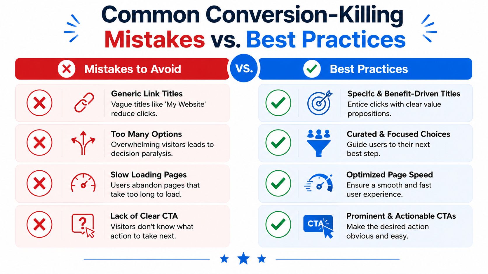
Four mistakes worth fixing today
Too many choices
A page packed with links feels helpful to the owner and confusing to the visitor. Curate the page around what matters now.Generic link titles
“Website” and “Click here” waste intent. Every link should communicate a specific payoff.Slow visual assets
Heavy hero images, oversized graphics, and cluttered layouts drag down the mobile experience. If the page feels slow, visitors leave before deciding.No clear primary CTA
If every item has equal visual weight, the page has no direction. One featured action should stand out immediately.
A quick audit standard
A useful audit can fit into less than five minutes:
Check | Pass if |
|---|---|
First screen clarity | The offer is obvious without scrolling much |
CTA strength | The main button or card tells people exactly what they get |
Page length | The layout feels tight, not endless |
Load experience | Images support the click instead of slowing it down |
Many creators assume adding more links increases the chance of a click. In practice, the opposite often happens. Focus converts. Excess distracts.
High-Converting Link in Bio FAQ
How many links should a bio page have
As few as possible, and as many as necessary.
A high-converting page usually has one clear primary action and a small set of secondary options. If a link doesn't support a current campaign or a common visitor need, it should probably be removed.
Should the bio page link to a homepage or a product page
Usually a product page, collection page, sign-up form, or booking page is the better choice.
The homepage is often too broad for social traffic. Bio visitors tend to arrive with a specific intent shaped by the content they just consumed. The destination should match that intent.
What's better for Instagram and TikTok, buttons or cards
Cards usually perform better when visuals help explain the offer. Buttons can still work for simple pages, but image-led layouts are often stronger for products, videos, launches, and lead magnets because they show value before the click.
How often should a bio page be updated
Whenever the campaign changes, and reviewed regularly even when it doesn't.
Product drops, webinars, launches, seasonal promotions, creator partnerships, and new content pillars should all trigger a page refresh. A stale bio page gradually loses relevance.
What should go at the top of the page
The highest-value offer tied to the most current audience intent.
For an e-commerce brand, that may be a featured collection. For a coach, it may be an application or booking flow. For a creator, it may be a free resource that moves visitors into email or a paid funnel.
Is branding really that important on a bio page
Yes, but not in the decorative sense.
Branding matters because consistency builds trust. The page should feel like a continuation of the Instagram, TikTok, or YouTube experience, not a disconnected utility page built from a generic template.
Creators, brands, and agencies that want a cleaner way to build this kind of micro-landing page can try Linkie, or jump straight into the free Linkie playground to test layouts, cards, and CTAs before replacing the bio link.